
1. Linen Sofa Slipcovers
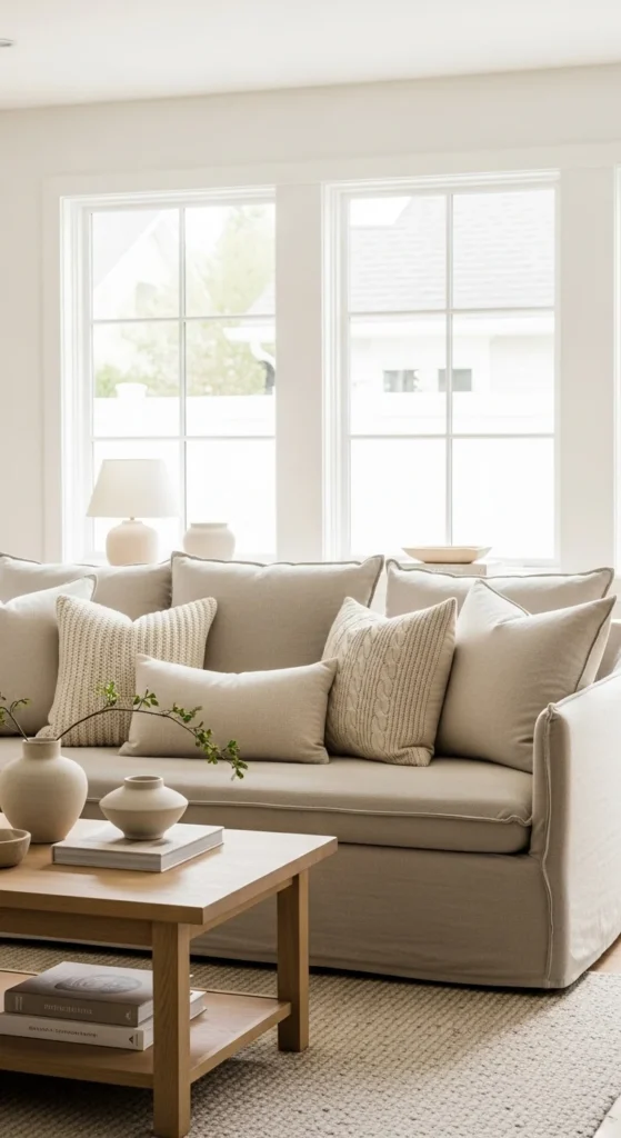
Linen slipcovers bring an easy, breathable look that feels right for spring. The texture alone adds quiet depth. Choose shades like oatmeal, ivory, or light flax for a calm base. If buying new isn’t in your budget, try a washable cotton-linen blend cover online or sew simple envelope covers for seat cushions.
Steam instead of ironing. The light wrinkling looks intentional. Layer in pillows with subtle stripes or tiny stitched details to avoid a flat look. Keep everything in a tight palette so the sofa reads soft, not busy.
Slipcovers also extend the life of older furniture. A dated couch suddenly feels current. If your sofa has skirts, remove them for a cleaner silhouette. For small rooms, stick with pale tones to keep things airy.
Soft neutrals age beautifully and shift easily through seasons. Come summer, swap pillows. Come fall, add warmer throws. The base stays the same. That’s the beauty of linen. Simple. Adaptable. Calm.
2. Ceramic Table Lamps in Warm White
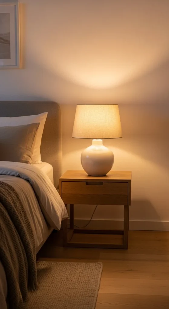
Lighting shapes the whole mood of a room. Ceramic lamps in creamy whites offer gentle presence without pulling attention. Look for rounded silhouettes or subtle ribbing. Avoid shiny finishes. Matte surfaces read calmer.
Thrift stores often carry solid ceramic bases. Swap the shade for a simple linen drum to update instantly. If the base color is off, a few coats of chalk paint fix that.
Stick to warm bulbs around 2700K. Cooler bulbs fight against neutral decor. Place lamps in pairs when possible. Bedsides. Console tables. Sofas. Symmetry brings visual rest.
Try oversized lamps in living spaces. Small lamps can feel fussy. One larger piece feels grounded. Add a small stack of books or a stone tray underneath for height balance.
Warm white lighting feels timeless because it mirrors natural light. It doesn’t chase trends. It simply works. And it makes every other neutral nearby look better.
3. Woven Jute Area Rugs
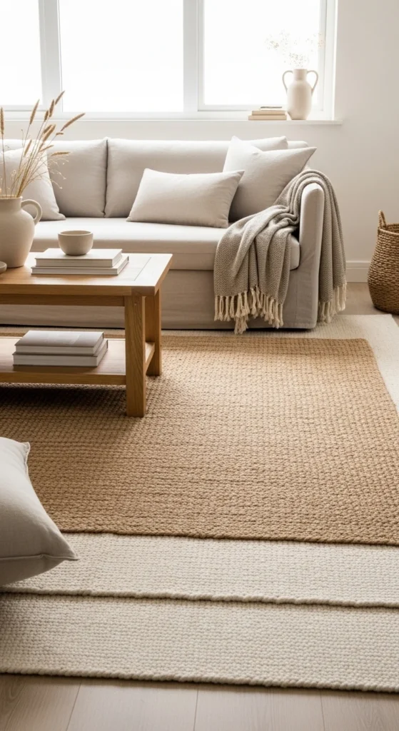
Jute rugs add texture without pattern overload. That’s their strength. They ground spaces quietly. Choose a flatweave style for durability. Thicker braids feel heavier and more rustic.
Layering is your friend. Place a small wool or cotton rug on top for softness. This combo feels intentional and lived-in. It also saves money because the top rug can be smaller.
Vacuum often. Skip heavy beating or soaking. Rotate once in a while to prevent uneven wear. If shedding happens early on, it usually calms down.
For dining rooms, go larger than you think. Chairs should stay on the rug when pulled out. In bedrooms, let jute peek out under the bed with a softer rug near your feet.
Natural fiber rugs bring quiet warmth without stealing focus. They let furniture shine. They pair with nearly any neutral palette. And they never feel seasonal.
4. Sheer White Curtains
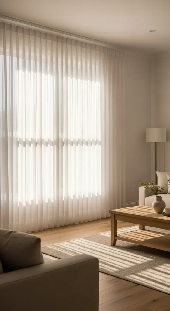
Sheer curtains soften windows instantly. They diffuse harsh light and add movement. Choose plain weaves. No shimmer. No heavy embroidery.
Hang panels high and wide. A few inches below the ceiling makes ceilings feel taller. Extending rods past the window frame makes glass look larger.
Budget trick: Use IKEA or big-box sheer panels and hem to length. Iron-on tape works fine. If privacy is important, layer with simple roller shades behind.
Stick to true white or warm ivory. Gray sheers often look flat. White reflects light and keeps rooms bright.
Let curtains brush the floor lightly. Puddling can look messy with sheers. Clean lines work better here.
Light-filtering fabric changes everything without adding clutter. It’s one of the easiest ways to soften a room for spring and beyond.
5. Stoneware Vases in Soft Shapes
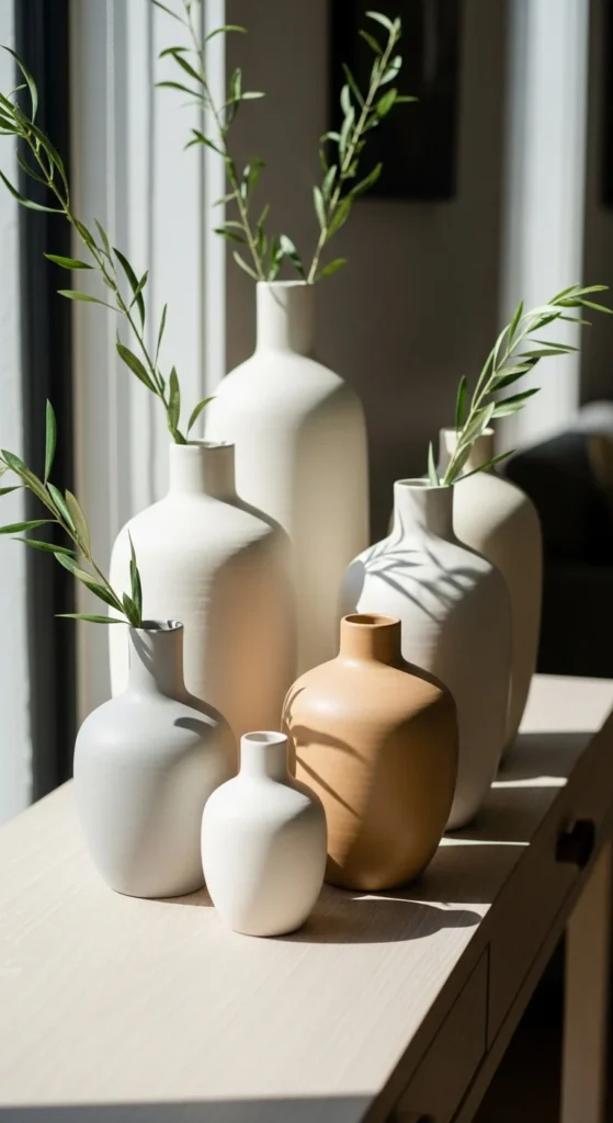
Stoneware vases add quiet character. Look for uneven rims. Soft curves. Slight color variation. These details bring warmth.
Group in odd numbers. Three or five works well. Keep heights varied but close in tone. Too many colors break the calm.
Fill with branches, eucalyptus, or dried grasses. Even empty, they look sculptural. That’s the goal.
If buying new feels pricey, check local potters, flea markets, or online seconds sales. Small imperfections usually mean discounts.
For DIY, use air-dry clay to form simple vessels. Paint with mineral or chalk paint. Lightly sand edges for a worn feel.
Handmade-looking ceramics feel timeless because they don’t try to be perfect. They quietly anchor shelves, consoles, and tables.
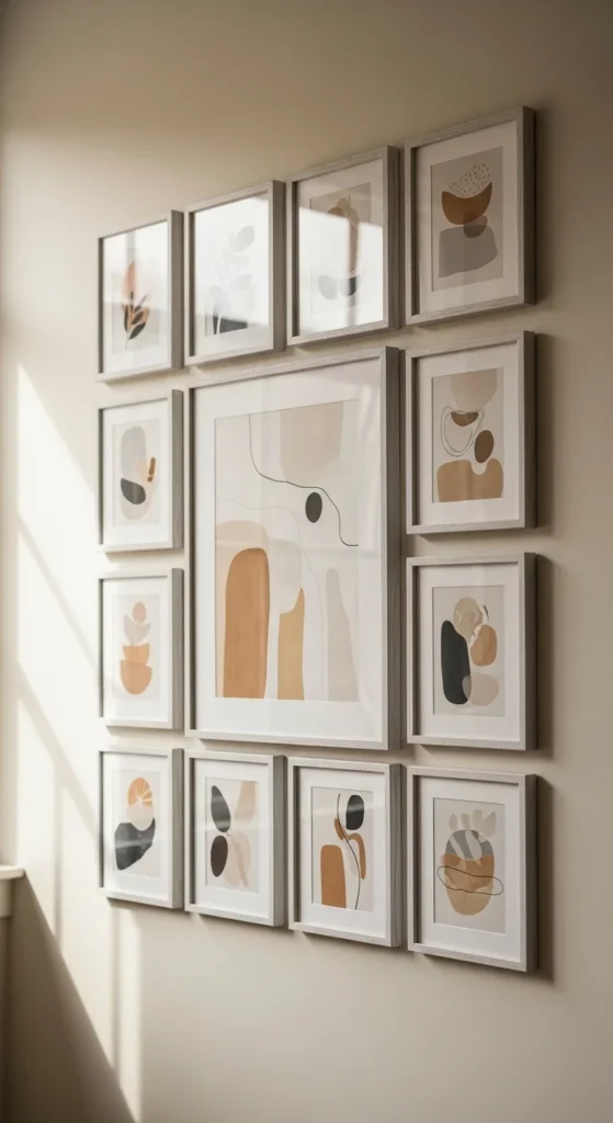
6. Neutral Botanical Prints
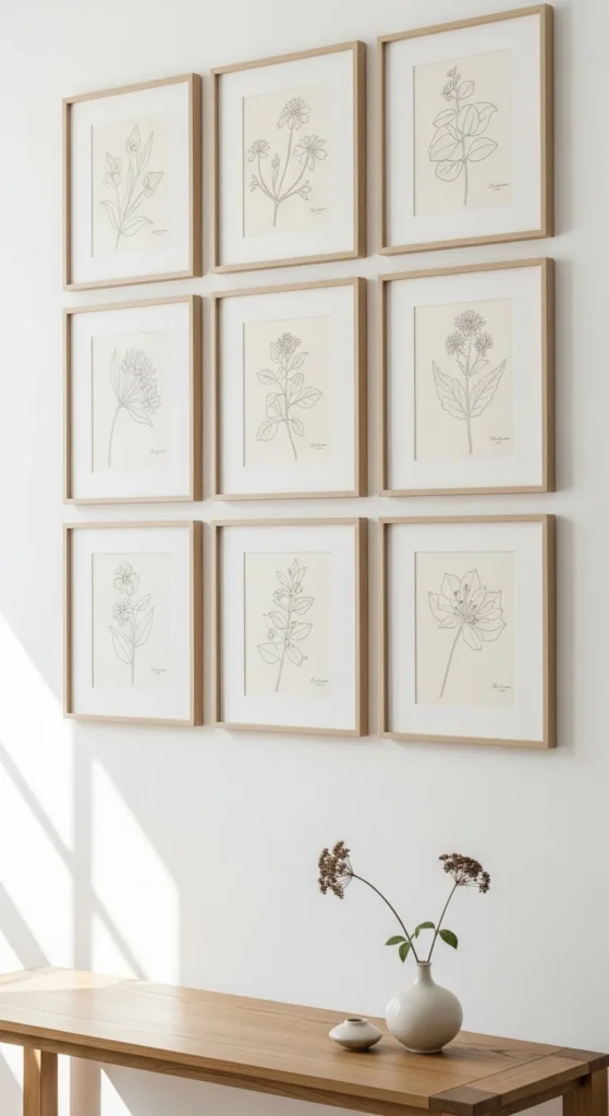
Botanical art fits spring without screaming “spring.” Stick to sketches, pressed plant scans, or muted watercolor.
Black ink can feel stark. Try taupe, gray, or soft brown. White mats keep everything light.
Printables save money. Choose high-resolution files and print on heavy matte paper. Pair with thin oak or maple frames.
Hang in pairs or small grids for structure. One oversized piece works too. Keep spacing consistent.
Avoid overly colorful florals. Let the subject be the star, not the pigment.
Quiet nature artwork feels gentle and works year-round. It adds life without pulling attention from the rest of the room.
7. Linen Table Runners
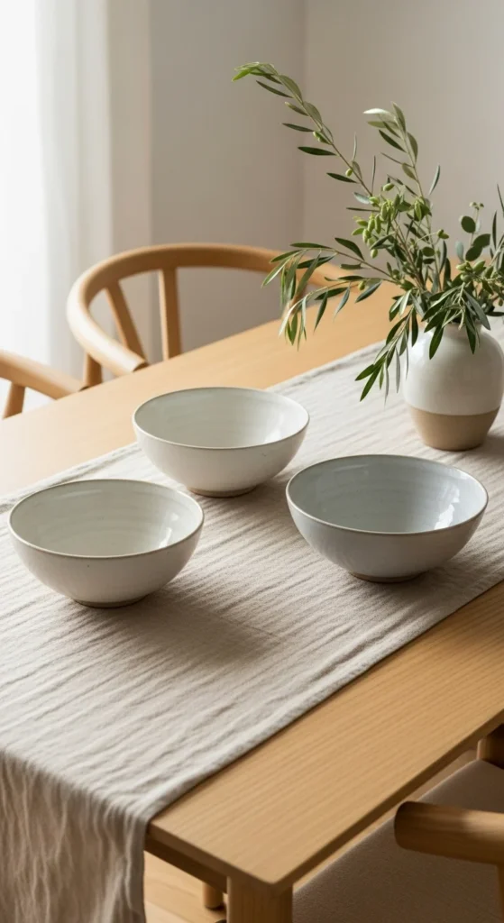
Linen runners soften hard tables. They add texture without covering everything.
Choose raw edges or subtle hems. Perfect seams feel stiff. A slightly rumpled look feels right.
For DIY, cut linen fabric to length. Wash. Let edges fray slightly. Done.
Keep color close to your table tone. Light wood with flax. Dark wood with ivory. Contrast should be gentle.
Layer a small tray or bowl on top. This anchors the runner and keeps it from looking lonely.
Simple textiles change a room fast and store easily. Swap runners seasonally while keeping dishes the same.
8. Light Wood Floating Shelves
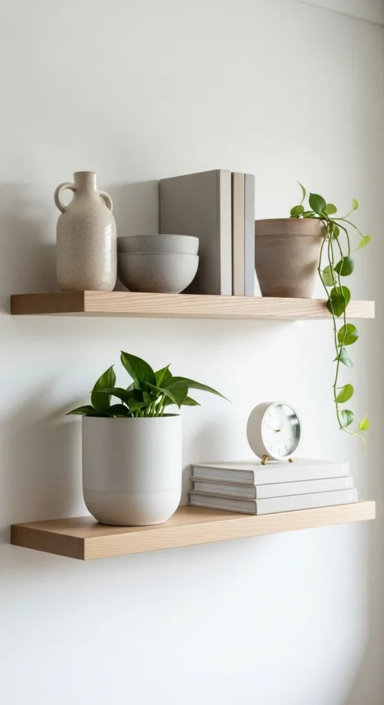
Floating shelves keep walls light. Light wood tones feel warm without heaviness.
Keep styling sparse. A few objects per shelf. Negative space matters.
Mix heights. Tall vase. Short bowl. Stack of books. Repeat materials.
DIY kits are affordable and sturdy. If staining, choose natural or whitewashed finishes.
Anchor shelves near something substantial like a sofa or console. Random placement feels off.
Open shelving feels relaxed and lets favorite pieces breathe.
9. Soft Neutral Throw Blankets
Throws invite touch. That matters.
Choose cotton, linen blends, or lightweight wool. Avoid heavy synthetics.
Fold over sofa arms or casually drape across a corner. Don’t overthink it.
Stick to subtle weaves. Herringbone. Loose waffle. Small-scale texture.
Wash often. Clean throws always look better.
Layered textiles add softness without adding clutter.
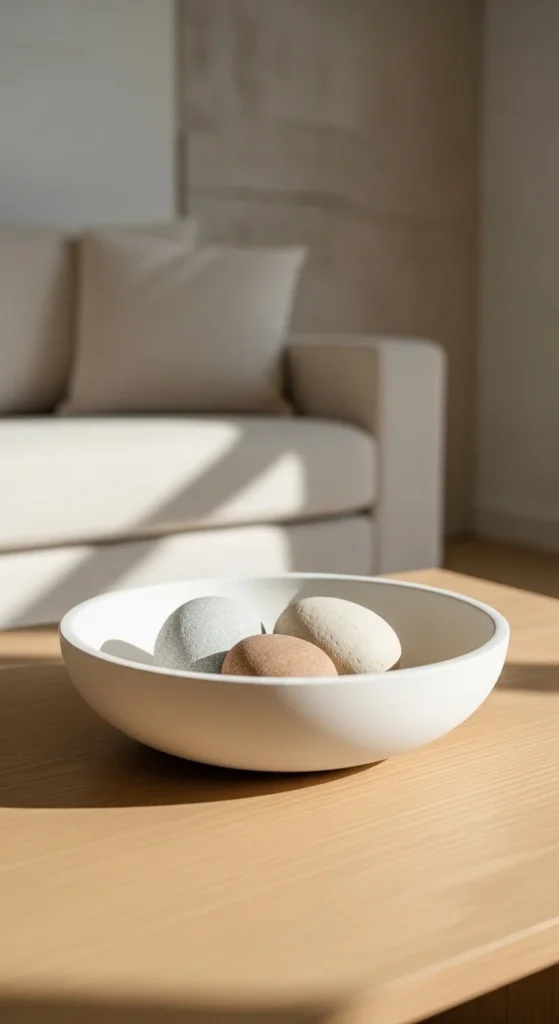
10. Travertine or Stone Trays
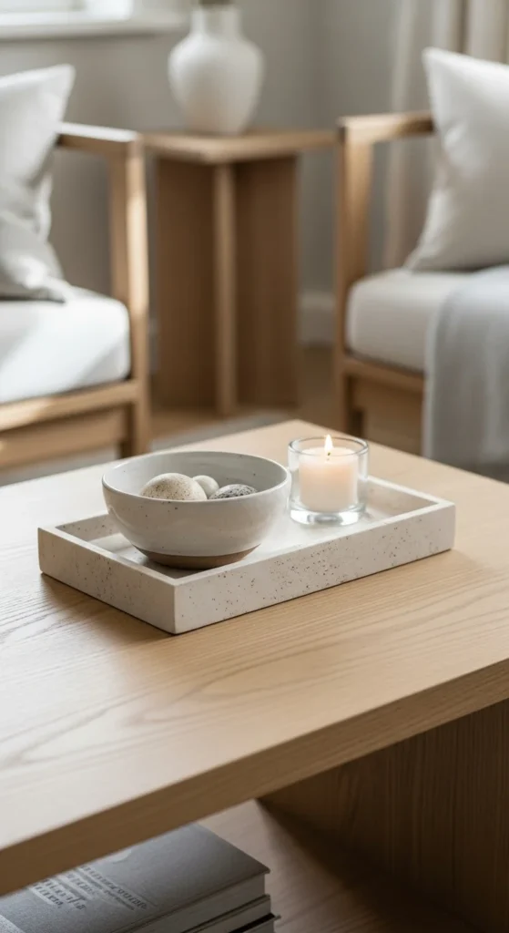
Stone trays organize visually. They corral small items and add weight.
Travertine, marble, or concrete all work. Matte finishes look calmer.
Use on coffee tables, nightstands, or vanities.
If stone is out of budget, resin trays in stone tones mimic the look.
Keep contents minimal. Two to three items max.
Natural stone grounds a space in a quiet way.
11. Pale Ceramic Dinnerware
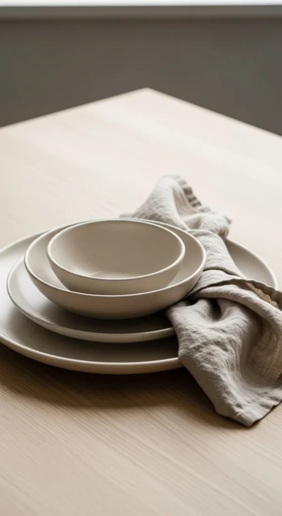
Simple dishes affect daily life. Matte ceramics feel calm and tactile.
Look for off-white, not stark white. Tiny speckles are a plus.
Open-stock buying lets you build slowly.
Mix shapes within the same color family.
Everyday objects shape atmosphere more than decor alone.
12. Whitewashed Wood Frames
Whitewashed frames bridge wood and white finishes.
DIY with watered-down paint and light sanding.
Keep art tones cohesive.
Use mats for breathing room.
Consistent framing feels timeless even when art changes.
13. Neutral Striped Pillows
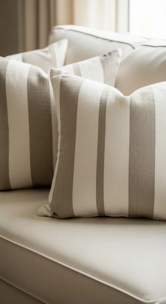
Stripes add pattern without chaos.
Stick to thin or faded stripes.
Mix with solid pillows.
Zip covers allow easy washing.
Quiet pattern adds depth without noise.
14. Ceramic Candlesticks
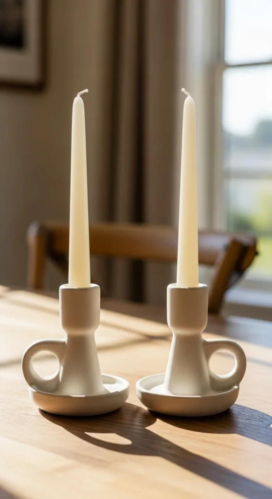
Ceramic candlesticks feel softer than metal.
Vary heights.
Use unscented tapers for dining.
Thrift finds shine here.
Simple candlelight changes mood instantly.
15. Neutral Entryway Runner
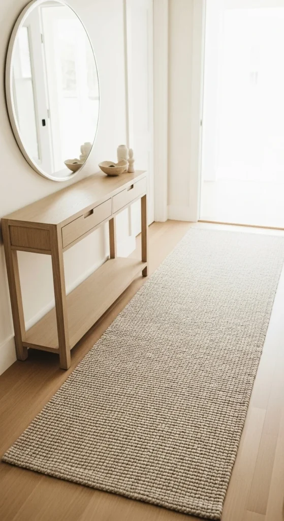
Runners define walkways.
Low pattern hides dirt.
Add rug pad.
First impressions feel calmer with soft flooring.
16. Dried Olive Branches
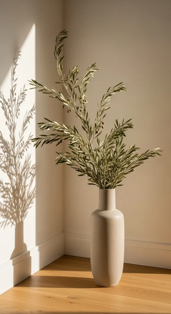
Olive branches look sculptural.
Last longer than fresh stems.
Trim to fit.
Subtle greenery feels timeless.
17. Textured Wall Paint
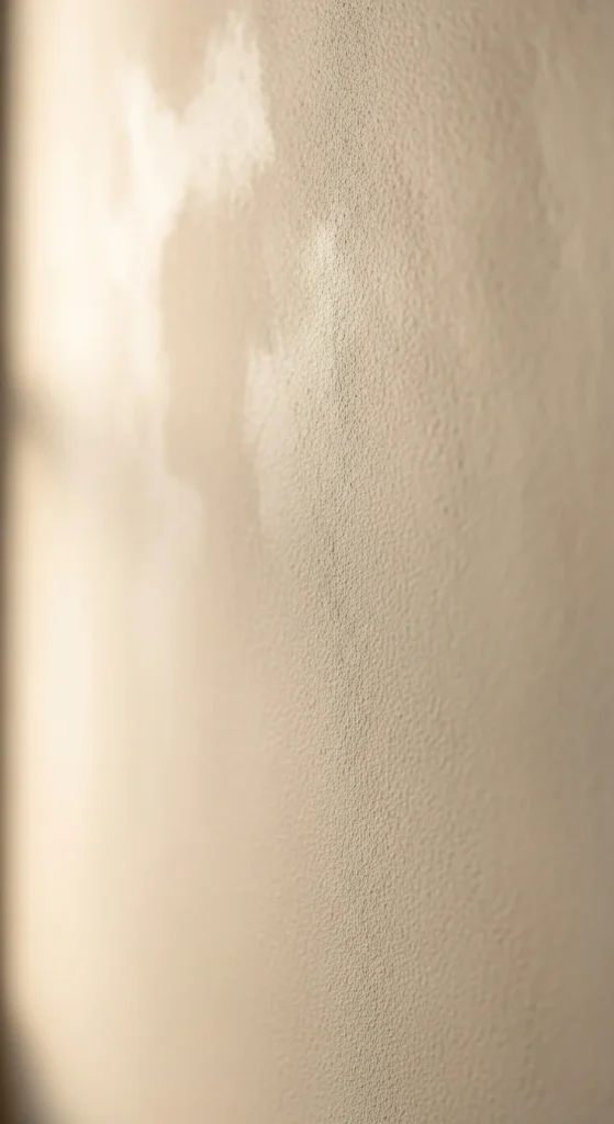
Limewash or mineral paint adds movement.
DIY kits available.
Test patch first.
Walls become artwork.
18. Woven Storage Baskets
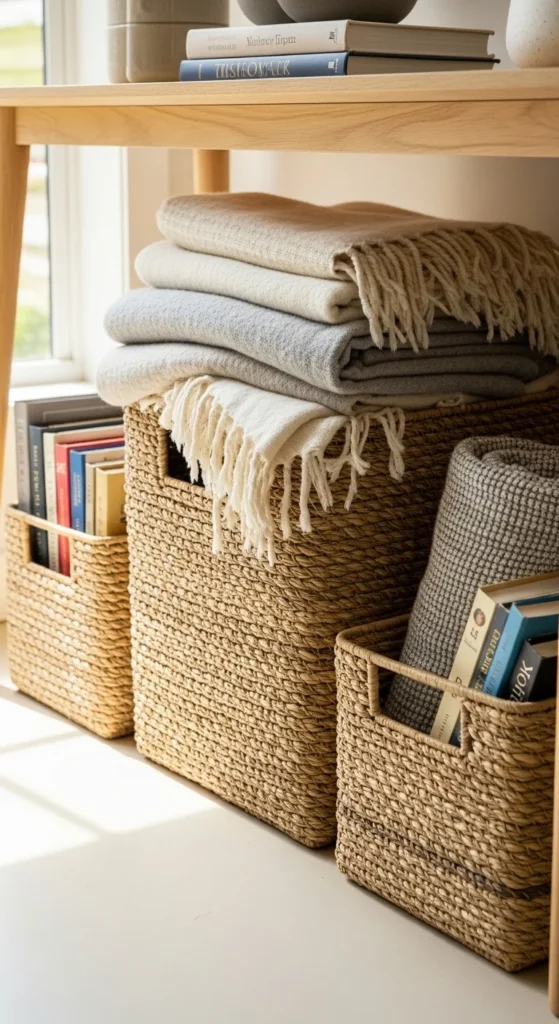
Hide clutter.
Stick to similar tones.
Add liners.
Storage can look beautiful.
19. Neutral Upholstered Bench
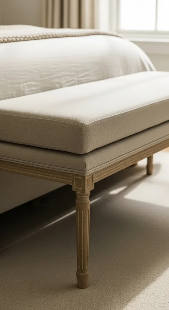
Adds seating and softness.
Great for bedrooms or entries.
DIY by reupholstering old bench.
Small furniture adds comfort.
20. Simple Round Mirrors
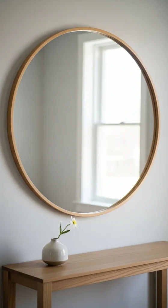
Rounds soften straight lines.
Reflect light.
Keep frames thin.
Curves balance a space.
21. Linen Bed Canopy
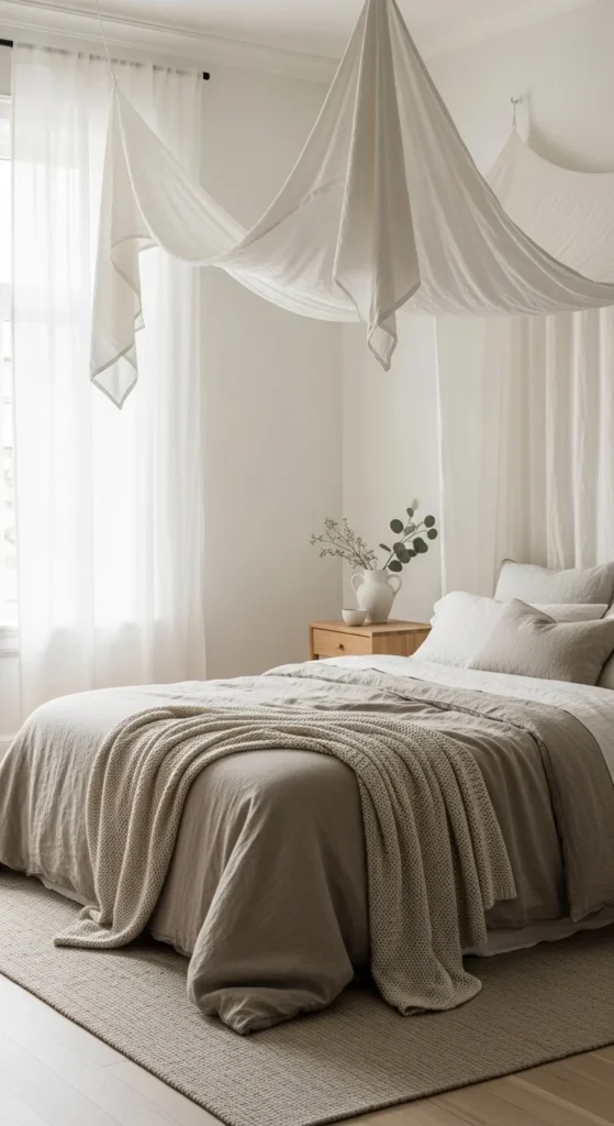
A linen canopy brings softness without feeling heavy. The fabric moves gently. It creates a quiet sense of enclosure that feels comforting.
Choose lightweight linen or cotton gauze. Skip thick drapes. Keep the canopy sheer enough to allow light through. Mount with ceiling hooks or a simple wooden frame. If drilling isn’t an option, use adhesive ceiling hooks rated for fabric weight.
Stick to white, ivory, or pale flax. Avoid strong undertones. Let bedding stay simple so the canopy becomes the feature.
You can DIY using curtain panels and basic hardware. No sewing required. Clip panels to rings and drape loosely.
Pair with neutral bedding and a single textured throw. Nothing busy.
Soft overhead fabric changes the entire room without adding furniture. It feels gentle. Calm. And quietly romantic in the best way.
22. Sculptural Plaster Bowls
Plaster bowls add quiet texture and soft matte surfaces. They look handmade. Slight imperfections are part of the charm.
Use as coffee table decor, console accents, or catchalls near entryways. Keep contents minimal. Wooden beads. Stones. Or nothing at all.
You can DIY with plaster of Paris and silicone molds. Sand lightly after drying. Seal with matte clear sealer.
Stick to warm whites, bone, or pale sand. Bright white can look harsh.
Pair plaster with wood and linen for balance.
Matte sculptural pieces feel timeless because they rely on shape, not trend. They sit comfortably in almost any neutral space.
23. Neutral Ceramic Planters
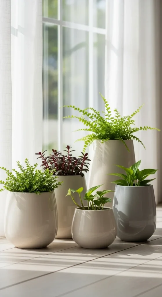
Planters matter as much as plants. Neutral ceramics keep greenery feeling calm and cohesive.
Choose simple shapes. Cylinders. Soft curves. No heavy patterns.
Mix sizes but keep colors close. Slight variation adds interest without clutter.
Thrift stores often have good ceramic pots. Spray paint with stone-finish or matte paint if colors don’t match.
Add matching saucers or hidden plastic liners to protect surfaces.
Greenery feels calmer when containers stay quiet. The plant becomes the focus. Not the pot.
24. Soft Neutral Wall Clock
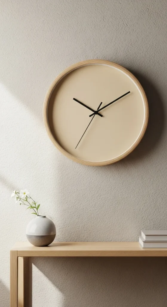
Wall clocks can be practical and beautiful. Look for clean faces. No bold numbers. No shiny chrome.
Pale wood frames or soft white frames work best. Thin profiles keep things light.
Hang where it’s visible but not central. Kitchen wall. Hallway. Home office.
If you already own a clock, paint the frame and swap the hands for black or soft brass.
Simple functional decor belongs in calm homes. It serves a purpose without shouting for attention.

Leave a Reply