
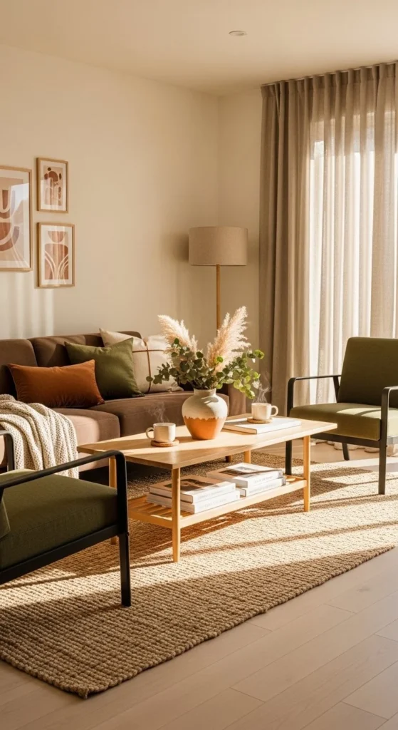
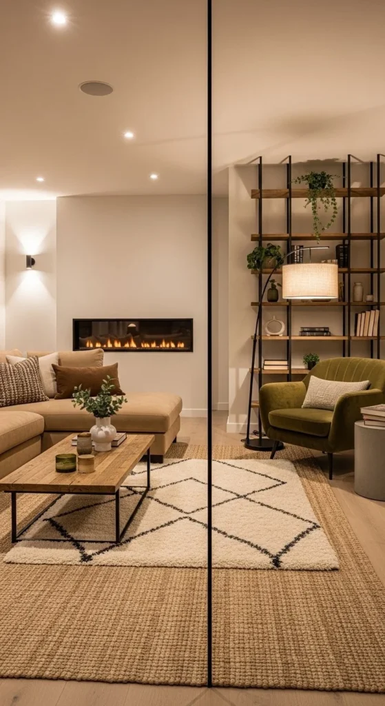
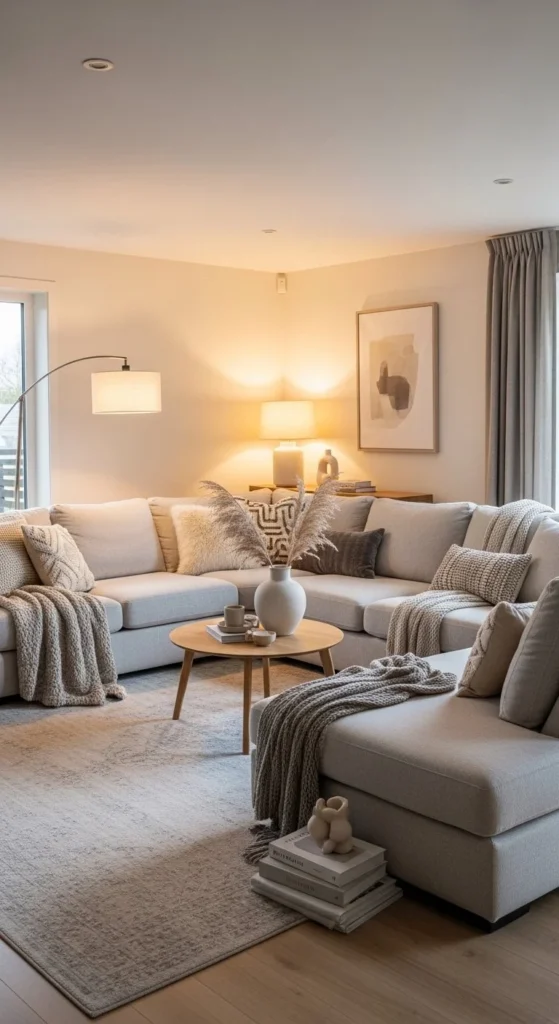
1. Curved Sofa Conversation Ring
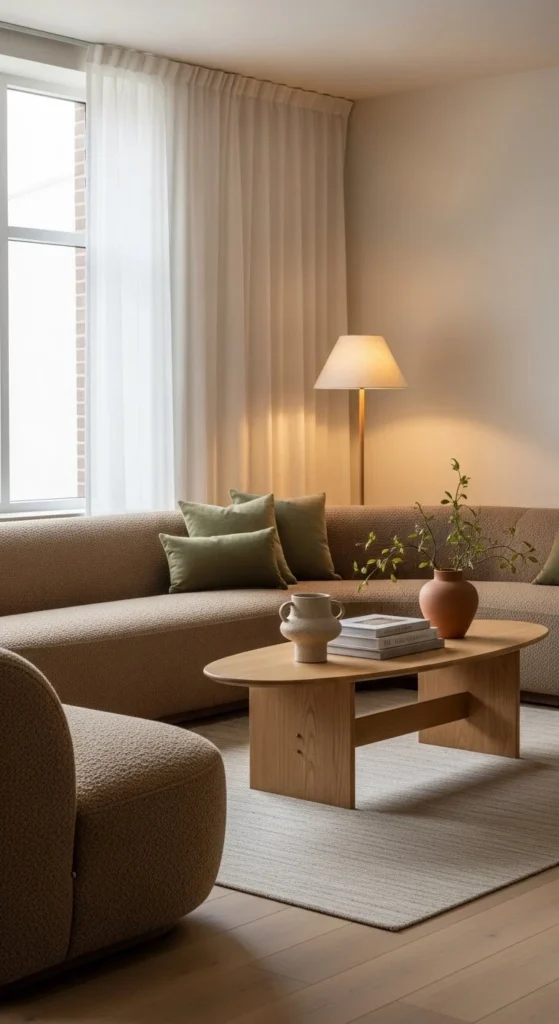
Curved sofas calm the room instantly. They guide movement without sharp stops. This layout works well in open plans where straight lines feel rigid. Place the sofa slightly off center to create a natural conversation ring. Keep the coffee table rounded to match the flow. Soft geometry encourages lingering.
For smaller rooms, choose a compact curve with slim arms. Low backs keep sightlines open. Budget tip: two armless modules angled inward can mimic a curve. Anchor everything with a round rug to define the zone. Avoid pushing the sofa against walls. Let it float. Add one sculptural chair opposite to balance the arc. Lighting matters here. Use a floor lamp with a domed shade to echo the shape. Keep accessories minimal. Let the form do the work.
2. Low Profile Gallery Layout
Low silhouettes stretch a room visually. They pull the ceiling higher without changing architecture. Choose a sofa with short legs and a tight back. Pair it with a narrow coffee table. Keep everything below eye level. Negative space becomes the feature.
This layout suits apartments and long rooms. Mount art slightly lower than usual to maintain proportion. DIY trick: swap sofa legs for shorter wooden blocks. It changes the whole feel for very little cost. Stick to one main color family. Add texture through rugs or throws instead of height. Floor lamps should arc outward, not up. Skip bulky side tables. Use wall mounted shelves instead. Circulation stays clean and uninterrupted.
3. Modular Sofa Zoning Plan
Modular seating allows rooms to shift with daily life. One setup for guests. Another for quiet evenings. Break the sofa into two clusters to create zones. A rug under each section helps visually separate them. Flexibility without clutter is the goal.
Choose modules with hidden connectors so pieces stay aligned. Budget option: use identical armless chairs in place of branded modules. Keep side tables lightweight and movable. This layout works well for hybrid living and working. Add a slim console behind one section to mark boundaries. Power outlets hidden in storage ottomans keep cords out of sight. Rearrange seasonally to keep the room feeling intentional.
4. Back to Back Seating Spine
Back to back seating creates a strong central spine. It organizes large rooms without walls. One side focuses on media. The other supports conversation. This layout handles traffic smoothly. Walkways stay clear. Clear purpose for each side reduces visual noise.
Choose sofas with low backs so the room doesn’t feel boxed in. A narrow console between them can hold lamps or storage baskets. DIY tip: use a custom plywood console wrapped in veneer. Built in shelves along walls help absorb sound and hide tech. Keep both zones visually related with shared colors. Rugs can differ slightly to signal function. This setup works especially well in family homes.
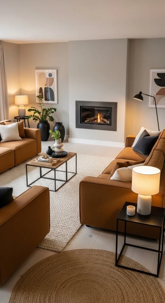
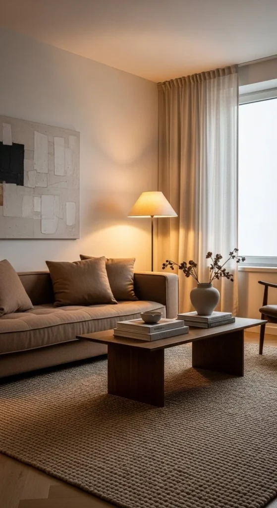
5. Earth Tone Anchor Layout
Earth tones ground modern layouts. They soften clean lines and add comfort. Start with one anchor piece in mocha or caramel. Build around it using tone on tone layers. Warm neutrals guide flow gently.
Avoid sharp contrasts. Let colors shift subtly. DIY idea: repaint existing furniture in muted clay or olive shades. Use limewash or chalk paint for texture. Keep metals brushed or patinated. Shiny chrome breaks the mood. Plants help connect zones naturally. Place them at transitions between seating areas. Lighting should stay warm and diffused. This layout suits rooms that feel cold or overly minimal.
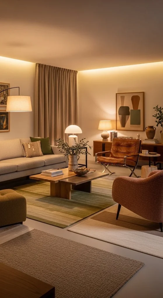
6. Sculptural Chair Spotlight Layout
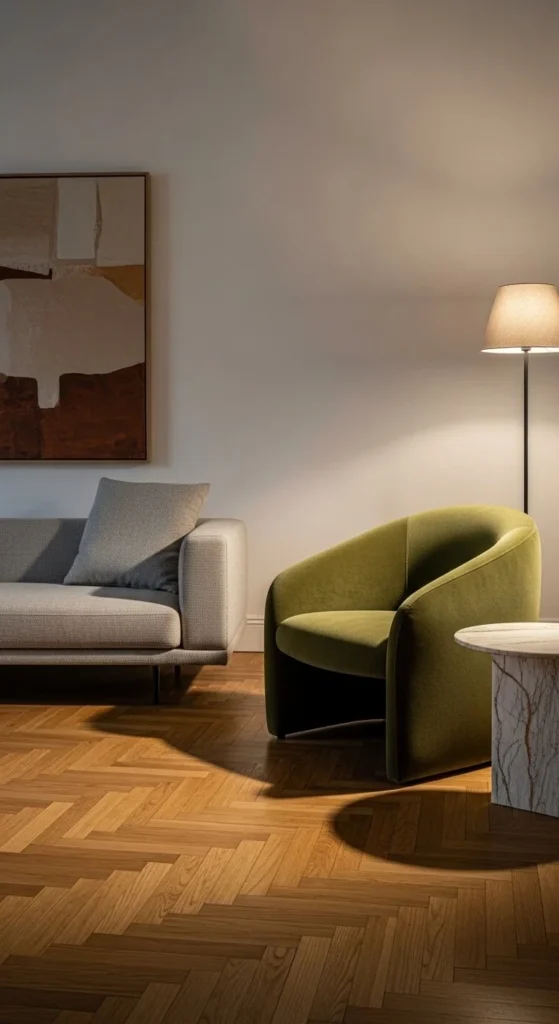
One sculptural chair can steer the whole layout. Place it slightly angled, never flat against the sofa. This creates motion and a natural pause point. The chair acts as visual punctuation. Contrast drives attention without clutter.
Choose a shape that disagrees politely with the sofa. Curves against straight lines work best. Keep the color deeper than the main seating. DIY friendly option: reupholster a vintage chair with textured fabric like bouclé or chenille. Use a small side table to mark the chair’s territory. Lighting should hit this spot directly. A narrow spotlight or adjustable sconce works well. This layout shines in medium rooms where symmetry feels stiff.
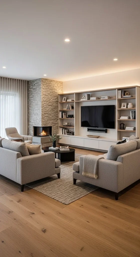
7. Built In Media Wall Layout
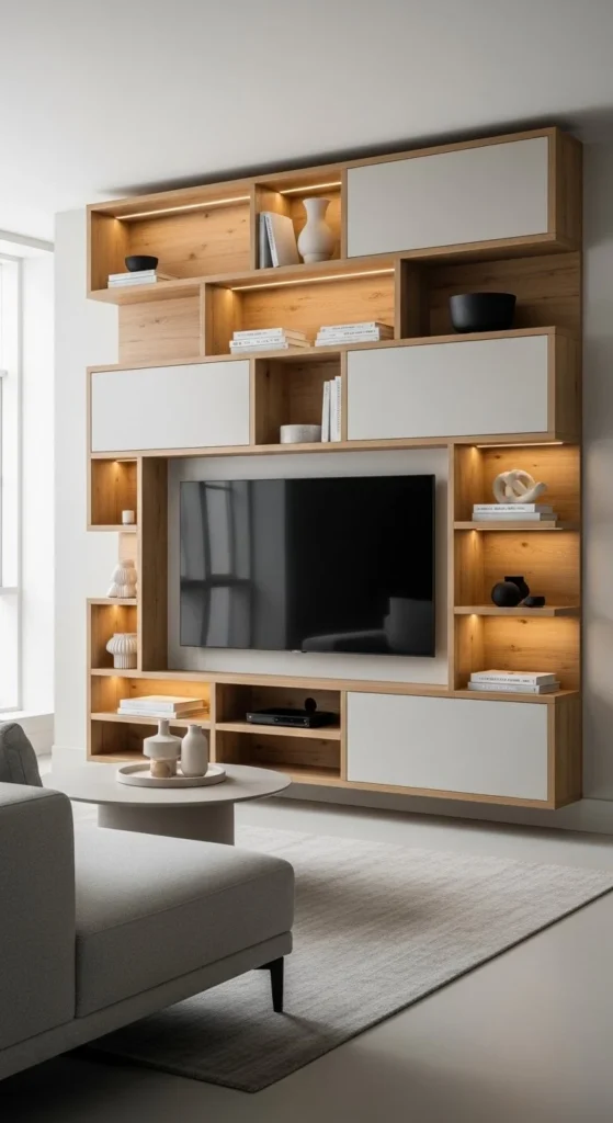
Built ins calm visual chaos. They absorb screens into architecture. Arrange seating directly opposite, keeping walkways wide on both sides. This layout simplifies decisions. Everything has a place.
If custom carpentry is out of budget, fake it. Use identical shelving units aligned tightly. Paint them the same color as the wall. Hide wires with surface mounted raceways painted over. Keep shelves lightly styled. Books low, objects spaced. Leave breathing room around the TV. Seating should stay low and simple to avoid competition. This approach works well in narrow living rooms with one strong focal wall.
8. Neutral Sofa With Color Pop Plan
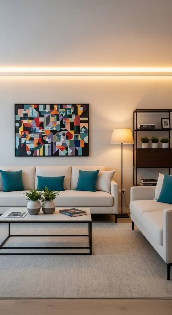
Neutral sofas act like blank canvases. They let layouts evolve without replacing big pieces. Add color through movable accents. Pillows. Art. Chairs. Change energy without commitment.
Place the sofa centrally. Use bold accents diagonally across the room to guide the eye. Avoid clustering color in one spot. Budget trick: rotate pillow covers seasonally. One accent chair can do more than multiple small items. Keep the base palette calm. Too many hues disrupt flow. This layout suits renters and long term planners alike.
9. Multifunctional Conversation Zones
Large living rooms feel empty without zoning. Break the space into clear conversational pockets. Rugs define boundaries. Furniture angles signal purpose. Zones invite use.
The main seating stays central. Secondary zones sit near windows or corners. Use a chair and lamp combo for reading. A small bar cart can mark another area. DIY tip: layer rugs instead of buying large custom sizes. Keep pathways wide and obvious. This layout works especially well for entertaining and shared homes.
10. Quiet Luxury Material Mix
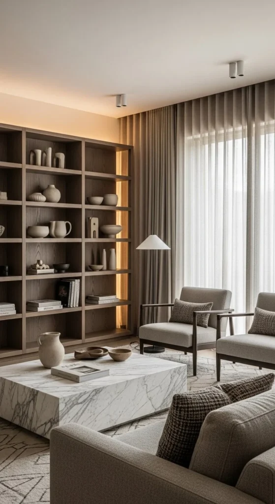
Materials can shape layout perception. Heavy textures ground furniture. Smooth surfaces guide movement. Use one stone piece as a visual anchor. Texture replaces ornament.
Balance stone with wood and fabric so nothing feels cold. Keep furniture spacing generous. Let materials breathe. Budget option: porcelain or concrete look surfaces instead of real stone. Focus on finishes, not logos. Lighting should skim surfaces, not flood them. This layout feels calm and deliberate without relying on excess decor.
11. Pattern Forward Jewel Box Layout
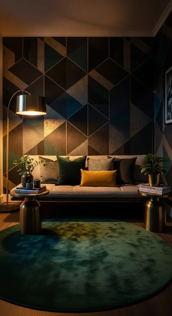
Small living rooms can handle bold pattern when the layout stays tight. Keep furniture close together. Let walls do the talking. This creates an enclosed, jewel like effect. Density feels intentional, not crowded.
Choose one dominant pattern. Everything else stays quiet. Low seating prevents visual overload. DIY tip: removable wallpaper offers flexibility without long term risk. Use matching tones across pattern and upholstery for cohesion. Lighting should be layered and dimmable. Skip overhead glare. This layout works well for apartments or secondary lounges.
12. Organic Coffee Table Flow
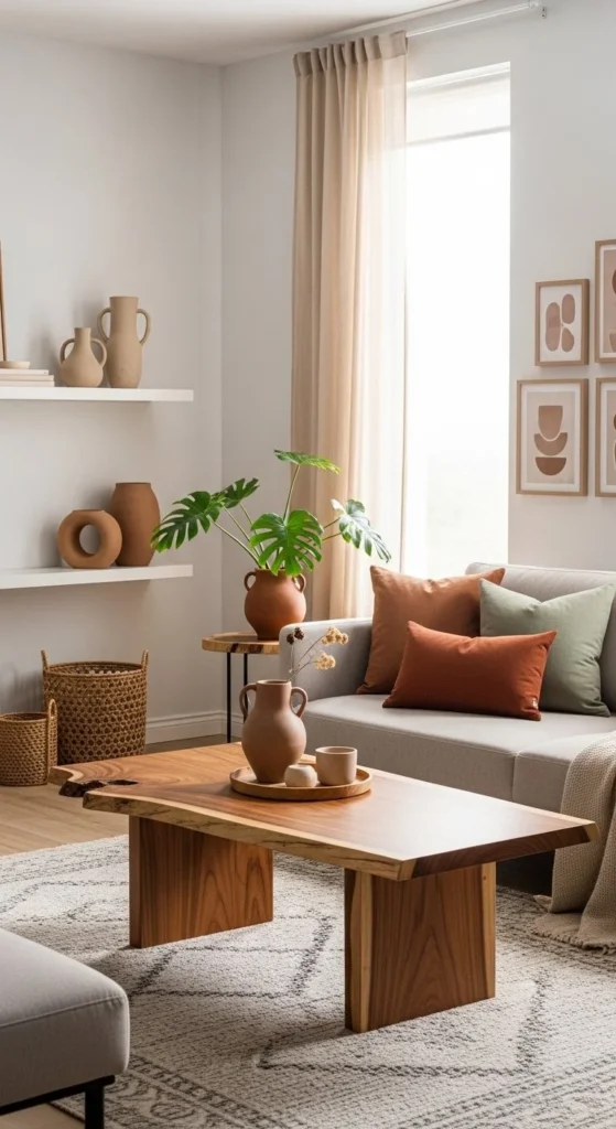
An irregular coffee table breaks rigid layouts. It softens straight seating lines. Movement around it feels intuitive. Asymmetry encourages circulation.
Pair organic tables with simple sofas. Let the table stand out. Budget idea: sand and seal a live edge slab or thrifted wood table. Keep enough clearance for legs and walkways. Use rounded accessories nearby to echo the shape. This layout suits homes where sharp corners feel too formal.
13. U Shaped Family Layout
U shaped seating pulls people inward. It supports long conversations and shared viewing. Place the open end toward windows or doors. This keeps the room welcoming. Enclosure without isolation.
Choose deep cushions for comfort. Keep tables low and centered. DIY option: combine a sofa with two matching chaises. Rugs must be large enough to hold all legs. Avoid extra chairs. This layout already feels full. Ideal for family rooms and movie nights.
14. Balanced Maximalist Shelf Layout
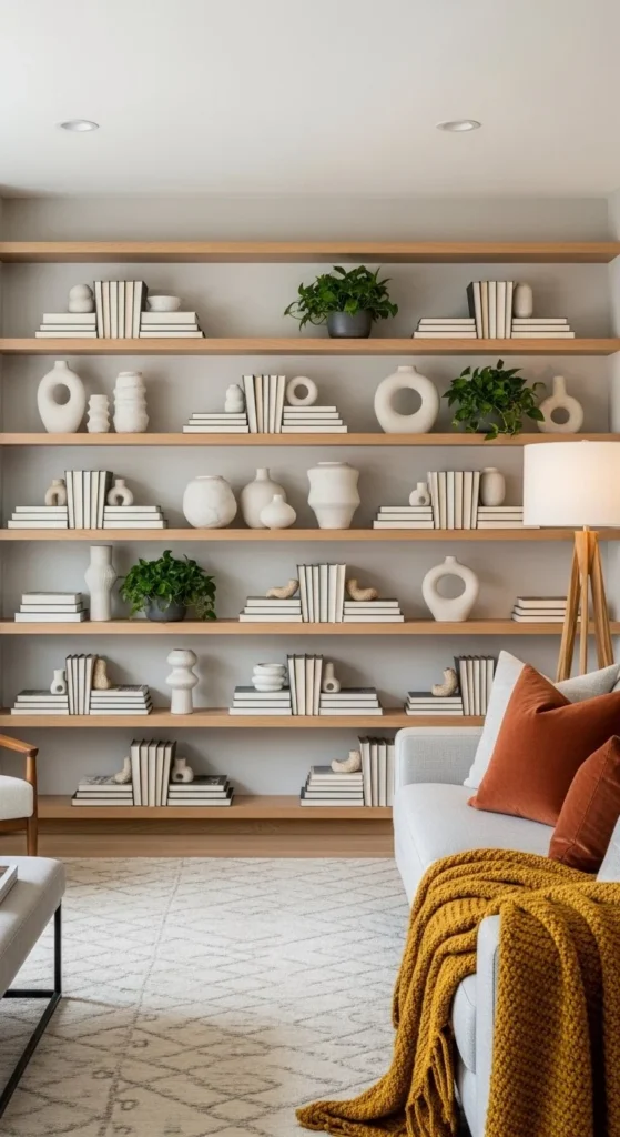
Shelving can define layout rhythm. Dense sections alternate with open gaps. This creates balance. Seating should align parallel to shelves. Order within abundance.
Group objects by tone, not size. Leave breathing room between clusters. DIY tip: style shelves from the floor up, not randomly. Use lighting inside shelves to add depth. Furniture stays simple so shelves remain the focus. This layout works for collectors who want control, not chaos.
15. Invisible Tech Living Zone
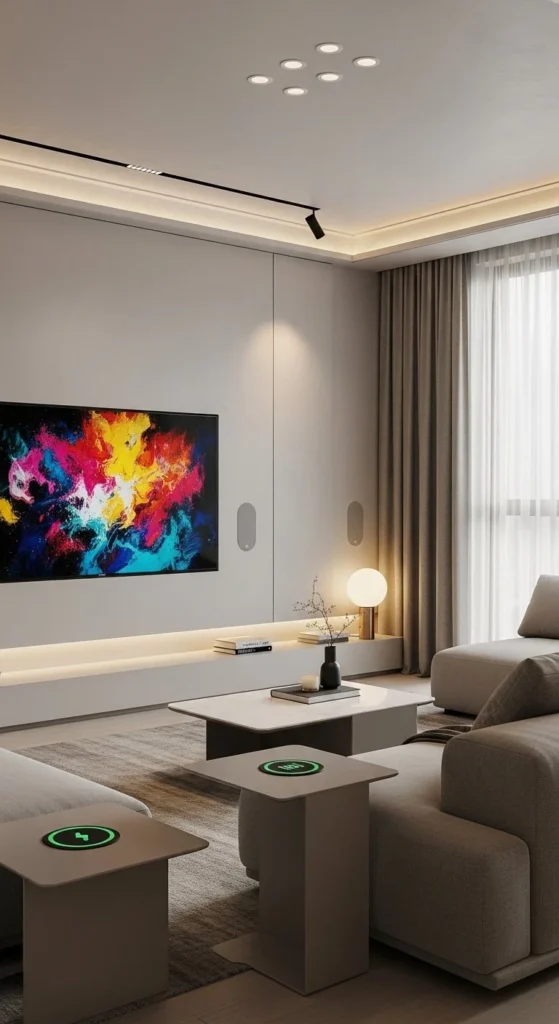
Tech disappears best when planned early. Arrange seating first. Then hide devices within furniture and walls. Art TVs blend into gallery walls. Function stays quiet.
Budget trick: frame a standard TV and mount it among artwork. Use fabric panels to hide speakers. Keep cables routed along baseboards. Seating should face the focal wall cleanly. Avoid angled chaos. This layout suits minimal homes that still rely on screens.
16. Sensory Comfort Seating Plan
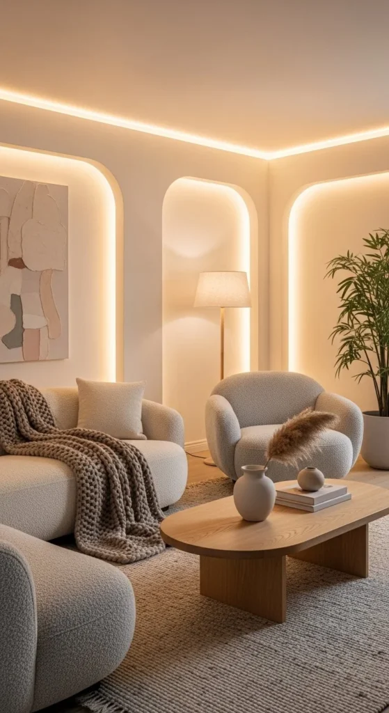
Comfort shapes layout decisions more than style. Deep seating encourages slower movement and longer stays. Arrange pieces closer than usual. This builds intimacy. Touch first design supports calm.
Choose fabrics with texture. Bouclé, chenille, brushed cotton. Budget option: add textured slipcovers instead of new furniture. Keep tables within easy reach. Avoid sharp edges. Lighting should glow, not glare. This layout works well in homes focused on relaxation and downtime.
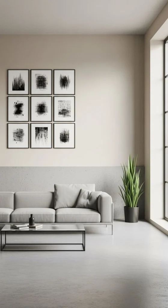
17. Art Aligned Furniture Grid
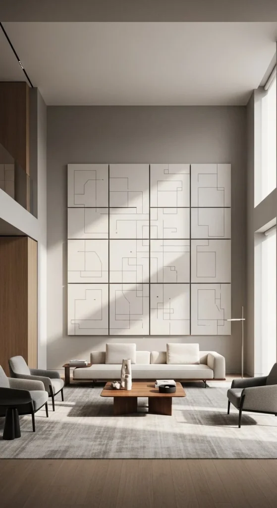
Art can dictate layout rules. Align sofa edges with artwork edges. This creates order instantly. The room feels planned without extra effort. Visual alignment calms the eye.
Measure carefully. Use painter’s tape to map placements before moving furniture. DIY tip: print large scale art on canvas or fabric for budget control. Keep furniture shapes simple so art stays dominant. This layout suits modern spaces with strong walls or trim details.
18. Antique–Modern Contrast Layout
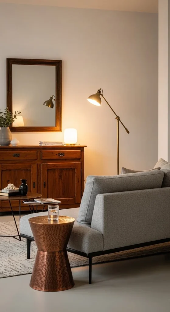
Contrast adds meaning. Place one antique piece as a counterpoint to modern seating. Let it sit slightly off center. This creates tension that feels intentional. Old meets new with purpose.
Refinish antiques lightly. Keep wear visible. Budget tip: thrift stores offer strong candidates. Pair with clean lined sofas so the room doesn’t drift stylistically. Lighting should highlight the older piece. This layout works in modern homes craving character.
19. Soft Curve Open Plan Layout
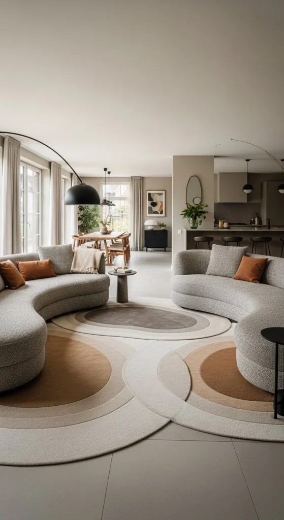
Open plans benefit from curves. They guide movement without barriers. Arrange seating in arcs that face inward. Walkways flow around them naturally. Movement feels intuitive.
Avoid straight rugs. Choose oval or round. Budget option: layer two smaller curved rugs. Keep accessories minimal. Let shape lead. This layout works well where living rooms blend into dining or kitchen areas.
20. Deep Seat Comfort Anchor
Deep seating sets the tone. Everything else follows its scale. Place the sofa first. Build outward. Keep distances short. Comfort becomes the anchor.
Choose a sofa with generous depth but slim arms. Budget trick: add lumbar pillows to standard sofas for similar effect. Tables stay low and wide. Avoid tall storage nearby. This layout works for lounging focused homes and relaxed hosting.
21. Mismatched Modern Flow Layout
Mismatched seating brings personality without breaking flow. The trick is cohesion through spacing, not sameness. Arrange pieces in a loose triangle so sightlines stay open. Each seat feels chosen, not random. Variation creates movement.
Stick to one shared element. Color temperature. Seat height. Or material undertone. That thread keeps things readable. DIY tip: re cover chair cushions in one unifying fabric. Use a single rug to ground everything. Avoid lining furniture up against walls. Let pieces float and breathe. Circulation paths should curve gently around seating, not cut straight through it. This layout works well for creative homes that feel stiff with matched sets.

Leave a Reply