
1. Oversized Boho Macramé Wall Hanging
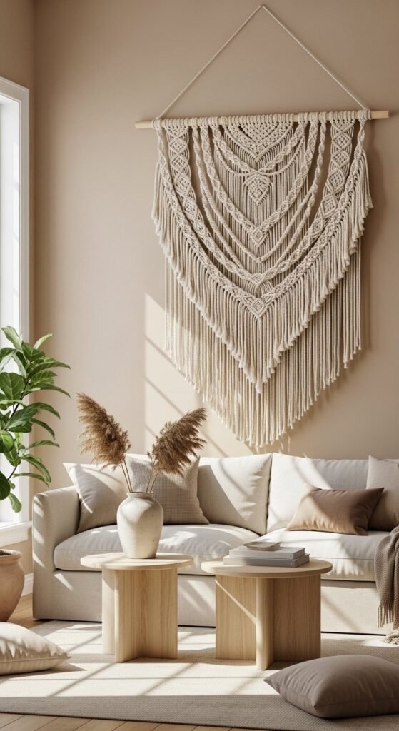
Macramé remains one of the strongest visual signals of handcrafted luxury. Large scale matters here. Smaller pieces fade. A wide, shoulder-to-shoulder hanging instantly anchors a blank wall. Stick to natural cotton or off-white yarn to keep the look calm and balanced. Wooden dowels or driftwood add warmth without pulling attention away from the knots.
For budget builds, start with basic squares and lark’s head knots. You don’t need complex patterns. Repetition creates order. That’s why reading is expensive. Hang it slightly higher than eye level so the fringe falls freely. This avoids the “craft fair” look.
In rentals, use heavy-duty adhesive hooks hidden behind the dowel. No drilling required. Pair macramé with smooth walls and simple furniture. Too much texture nearby can crowd the space. Let it breathe.
Scale and spacing do the heavy lifting here. One large piece beats three small ones every time. Keep the palette tight. Let the knots do the talking.
2. Clay Starburst Wall Sculptures
Clay wall art signals custom work. That’s why it reads high-end so quickly. Starburst or abstract forms work best because they don’t rely on drawing skill. Imperfection actually helps. Slight finger marks add character once painted.
Use air-dry clay over MDF bases for strength without weight. Keep thickness consistent. Uneven edges feel intentional when the form is simple. Paint with chalk or mineral paint in warm neutrals. Avoid gloss. Matte finishes absorb light and feel grounded.
Hang in odd numbers. Three or five pieces arranged loosely feel curated, not planned. Leave generous spacing so each form stands alone. Tight clusters look busy.
For smaller budgets, scale down and repeat the same mold shape. Uniformity gives cohesion. For renters, use removable mounting strips rated for frames.
Clay art works best on quiet walls. No wallpaper. No competing frames. This is sculpture, not decor filler. Texture over color is the rule that keeps it refined.
3. Upcycled Basket Wall Grid
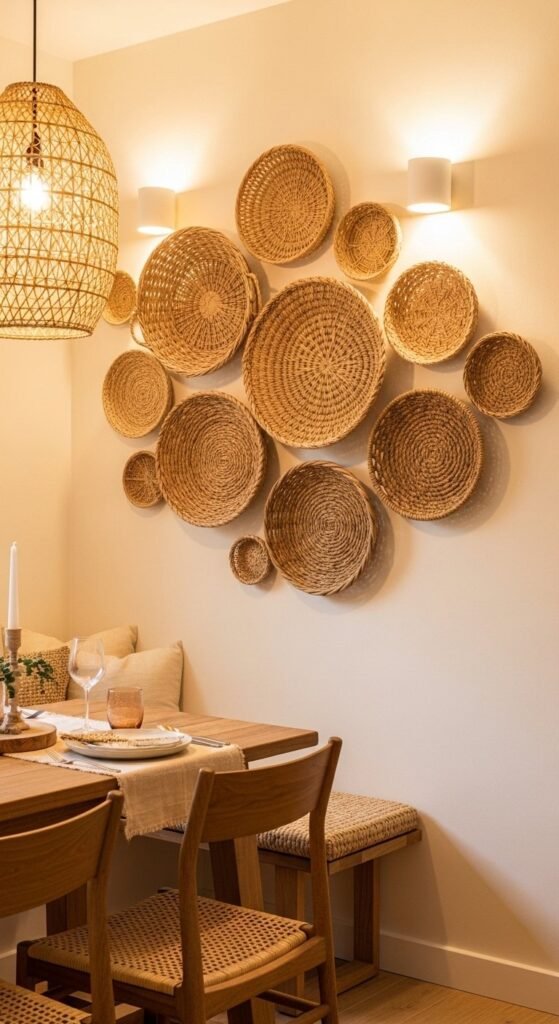
Basket walls look layered and intentional when done right. The mistake most people make is mixing too many colors. Stick to one fiber family. Rattan, seagrass, or palm. Not all three.
Thrift stores are the goldmine here. Look for shallow baskets so they sit flat. Deep bowls cast harsh shadows and pull the wall forward. Before hanging, lay everything on the floor and adjust spacing until the layout feels balanced.
Mount larger baskets first. Then fill gaps with smaller ones. Avoid perfect symmetry. Slight irregularity keeps it relaxed. Use plate hangers or removable hooks depending on wall rules.
To keep it from feeling rustic-heavy, surround the baskets with clean lines. A simple table. Plain chairs. Neutral paint. Contrast is what makes the wall read polished.
Texture repetition is the trick. Different shapes, same material. That consistency is what makes the wall feel curated instead of collected.
4. Painted Arch Accent Wall
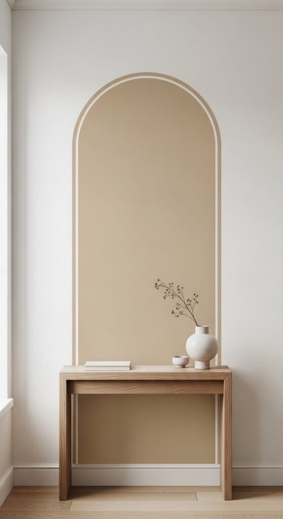
Painted arches are everywhere for a reason. They mimic architectural depth without construction. Use warm neutrals like beige, clay, or muted green. Sharp white against color keeps edges crisp.
Measure carefully. A lopsided arch ruins the effect. Use a string and pencil to guide the curve. Painter’s tape helps, but slow brush control matters more than tools.
Keep the surrounding decor minimal. One mirror. One lamp. Too many objects compete with the shape. The arch should frame, not fight.
For renters, this still works. Many landlords allow paint if it’s returned to white later. One quart is enough. That makes it low risk and low cost.
Avoid bold colors here. The shape is the statement. Soft contrast keeps it timeless and adaptable across seasons.
5. Hanging Dried Floral Wall Chains
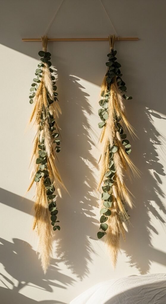
Dried florals bring movement to walls without frames. Vertical chains draw the eye upward, making ceilings feel taller. That’s a quiet luxury trick.
Stick to muted tones. Tan, beige, faded green. Bright colors age fast. Secure stems with floral wire or twine wrapped loosely so it looks intentional. Perfect symmetry isn’t the goal.
Hang in pairs or trios. Single chains can feel accidental. Space them evenly but not rigidly. Let gravity shape the look.
For budget builds, forage responsibly or dry grocery-store flowers upside down for a week. Use lightweight hooks so walls stay clean.
This works best in bedrooms, reading corners, or calm dining spaces. Avoid kitchens or high-humidity areas. Subtle movement is what keeps these from feeling static.
6. Framed Fabric Panels
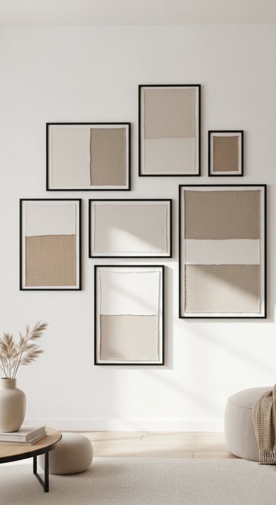
Fabric wall art reads custom when patterns stay quiet. Linen, cotton, or canvas work best. Avoid bold prints. Texture should be felt, not announced. Think raw edges, subtle weaves, gentle creases.
Use identical frames for consistency. Black or light wood keeps things grounded. Cut fabric slightly larger than the frame backing so it wraps cleanly. Staples stay hidden. No glue mess.
Hang panels in a straight row or a soft grid. Uneven spacing breaks the effect. Measure carefully. Precision is what makes fabric feel intentional instead of improvised.
For low-cost options, look at curtain samples, table runners, or thrifted textiles. Even old scarves can work if the weave is calm. Iron lightly before framing.
This style works especially well in living rooms and hallways. Pair it with smooth walls and minimal furniture. Quiet repetition is the reason this feels gallery-level without the gallery price.
7. Clay Moon Phase Wall Art
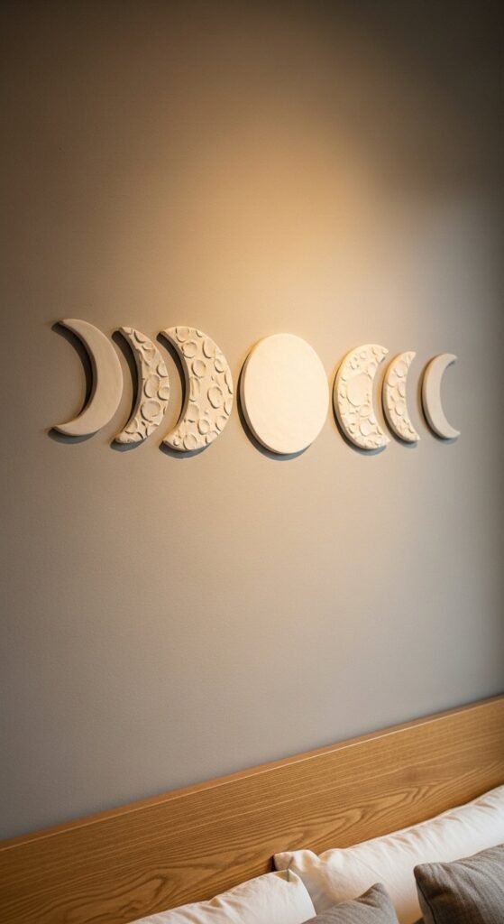
Moon phase art blends boho and minimal without trying too hard. Keep shapes simple. Circles and crescents only. Over-detailing ruins the calm.
Air-dry clay is enough here. Roll evenly. Use bowls or cups to trace perfect curves. Texture comes from fingers or a soft sponge. Once dry, paint with chalk paint in warm neutrals. Avoid shimmer.
Spacing matters more than size. Leave enough room so each phase stands alone. Too close and it looks decorative. More space makes it feel sculptural.
Mount with removable adhesive strips. Clay pieces stay lightweight if kept thin. This keeps walls safe for rentals.
Moon phases work best above beds, consoles, or low shelves. Surrounding decor should stay minimal. Let the rhythm of shapes do the work. Form over ornament is what keeps this looking refined.
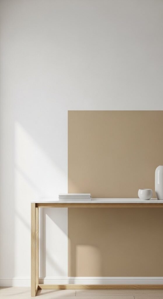
8. Faux Limewash Paint Panels
Limewash texture reads high-end because it looks architectural. You don’t need real limewash. Regular paint plus technique gets close.
Mix two similar neutral tones. Apply the base coat. Then layer the second color using a damp brush in loose crisscross motions. Step back often. Overworking kills the effect.
Limit the painted area. Full walls can overwhelm small rooms. A panel behind furniture keeps it controlled. Tape edges clean for sharp borders.
Use this behind entry tables, beds, or dining consoles. Keep furniture simple so the wall stays the focus.
Budget-friendly and renter-aware tip: apply on a large MDF board instead of the wall. Mount it like art. Same effect. Zero repainting later.
Soft variation is the goal. If it looks dramatic up close, it’s too much.
9. Vintage Plate Wall Arrangement
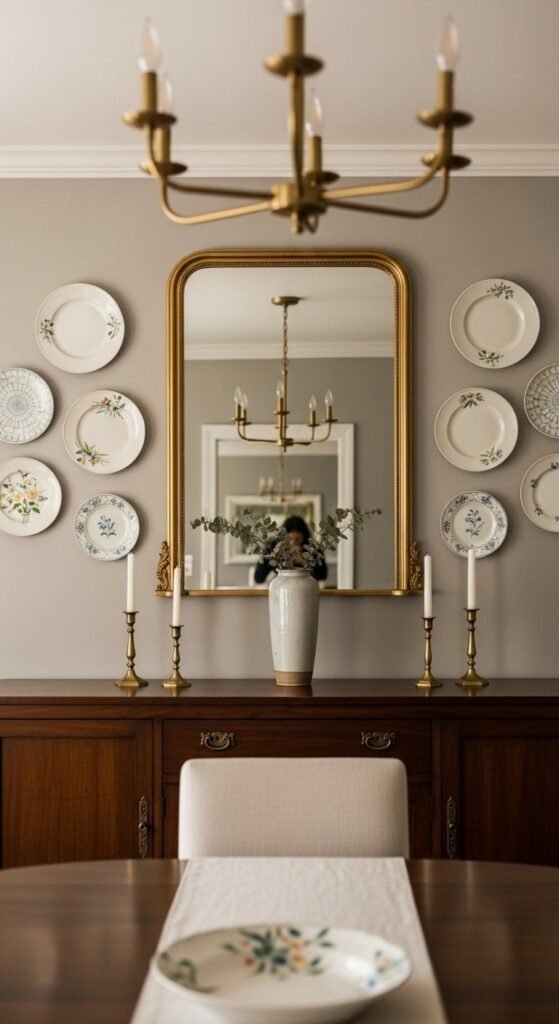
Plates work when color stays restrained. White, cream, soft blue. Avoid loud florals. The goal is cohesion, not nostalgia overload.
Mix sizes but keep patterns related. One floral style. One border style. Random collections look cluttered. Intentional sets feel styled.
Lay everything out on the floor first. Take a photo. Adjust spacing before committing. Plate hangers make mounting clean and reversible.
This style shines in dining rooms and breakfast nooks. It pairs well with wood tables and neutral walls. Keep surrounding art minimal.
For budget sourcing, thrift stores and flea markets are unbeatable. Chips don’t matter if they’re minor and turned inward.
Consistency in tone is what makes this feel curated instead of dated.
10. Wooden Pegboard Feature Wall
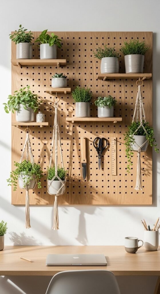
Pegboards can look refined when clutter stays controlled. Choose natural wood or paint it to match the wall. White or warm beige blends best.
Limit accessories. Empty space matters. A crowded pegboard turns chaotic fast. Use matching pegs and shelves to keep the system calm.
This works well in home offices, kitchens, or entry zones. Mix function and restraint. One plant. One shelf. One hook cluster.
DIY versions are simple. Plywood, drilled holes, sanded edges. Seal with matte varnish for a clean finish.
For renters, mount with French cleats or removable wall anchors rated for weight. Avoid heavy loads.
Pegboards succeed when treated like wall art, not storage overflow. Order creates luxury, even in practical pieces.
11. Geometric Yarn Wall Panels
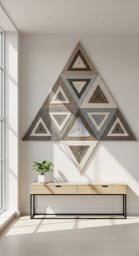
Geometric yarn art works because it blends softness with structure. The key is restraint. Pick one shape family triangles or arches and repeat it. Mixing shapes weakens the visual logic.
Use cardboard or thin MDF as the base. Wrap yarn tightly and evenly. Loose wrapping looks unfinished. Neutral yarns photograph better and age slower than bright colors. Think sand, stone, and muted clay.
Mount panels with equal spacing. Alignment matters more than size here. Even a small misalignment shows. Use a level. Take your time.
This style suits living rooms and stairways where you want interest without noise. Keep nearby furniture clean-lined. Avoid pairing with heavy textures like shag rugs or busy curtains.
For low-cost builds, use leftover yarn or thrifted sweaters unraveled for fiber. Repetition and precision are what make this feel intentional rather than crafty.
12. Minimal Mirror Cluster
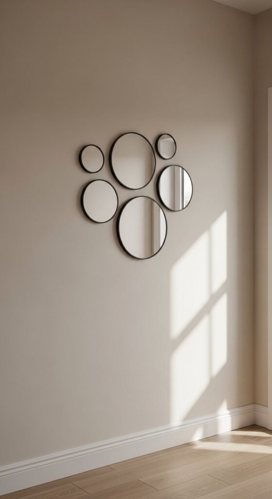
Mirrors add depth without adding clutter. Small mirrors grouped together feel curated when the frames match. Black, brass, or wood pick one and stay consistent.
Avoid perfect symmetry. A loose cluster feels natural. Start with the center mirror, then build outward. Keep spacing even to maintain order.
This works especially well in narrow hallways or stair landings where light is limited. Mirrors bounce light and open the space visually.
For budget options, check discount stores or thrift shops. Even mismatched mirrors can work if frames are painted the same color.
Mount using removable hooks rated for weight. Always test one first.
The secret here is uniform framing. That’s what turns simple mirrors into a wall feature.
13. Reversible Seasonal Wood Hangings
Reversible wall decor is practical and quietly clever. One piece, two looks. That alone adds value. Keep designs simple so flipping feels intentional, not gimmicky.
Use thin plywood or craft boards. Paint each side differently but within the same color family. For example, botanicals on one side, abstract shapes on the other.
Hang with visible leather or fabric straps so flipping stays easy. Hidden mounts complicate things.
This works well in living rooms or entry spaces where seasonal changes feel natural. Swap designs without storing extra decor.
Budget builds cost very little. Paint and wood scraps are enough. The payoff comes from planning, not materials.
Adaptability without excess is what makes this feel thoughtful and refined.
14. Japandi-Inspired Neutral Art Ledges
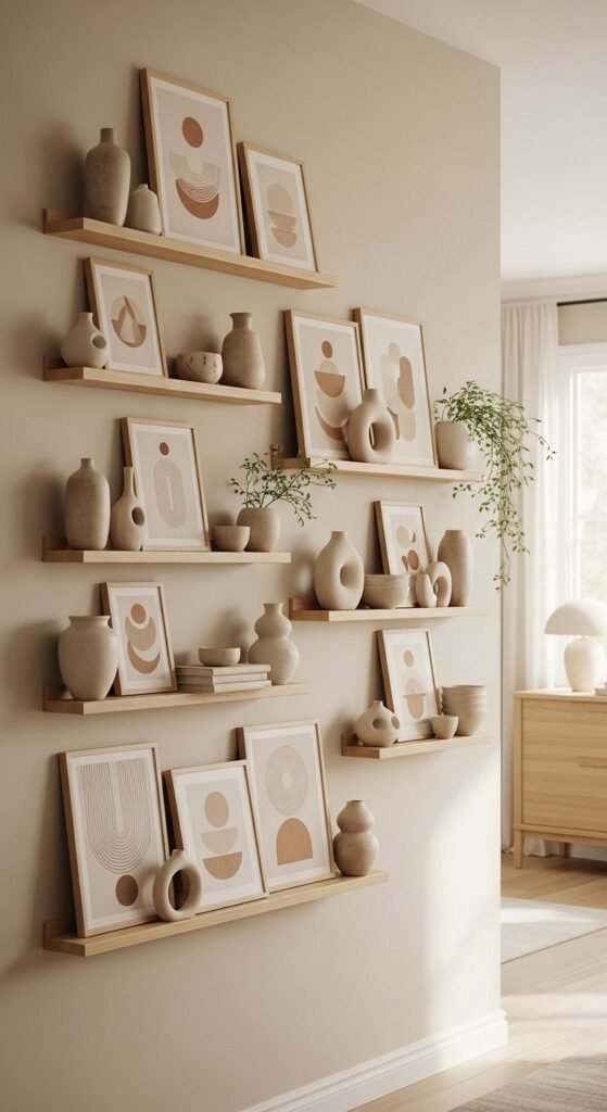
Art ledges allow flexibility while staying controlled. Japandi style works best with light wood and neutral backdrops. Avoid dark stains. Keep everything soft and calm.
Limit what goes on the ledge. Two or three items per section is enough. Stack one frame, lean another, then stop. Negative space matters.
DIY ledges are simple. Straight boards, hidden brackets, sanded edges. Paint or seal lightly so grain stays visible.
This setup works well behind sofas or desks. It lets you rotate art without rehanging nails.
For renters, use shorter ledges and fewer anchors. Always check weight limits.
The reason this reads expensive is visual balance. Nothing fights for attention.
15. Denim Textile Wall Art
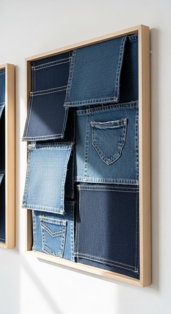
Denim on walls feels unexpected when done cleanly. Stick to one tone family indigo, faded blue, or gray-blue. Mixing washes adds depth without chaos.
Cut fabric into uniform shapes. Squares or rectangles work best. Visible stitching adds detail but keeps it subtle.
Frame simply. Light wood or black frames ground the texture. Avoid ornate frames they clash with denim’s honesty.
This works well in casual living rooms, home offices, or creative spaces. Pair with neutral furniture so the wall doesn’t feel heavy.
For budget sourcing, old jeans work perfectly. Even worn areas add character when framed thoughtfully.
Material honesty is what makes this feel modern instead of crafty.
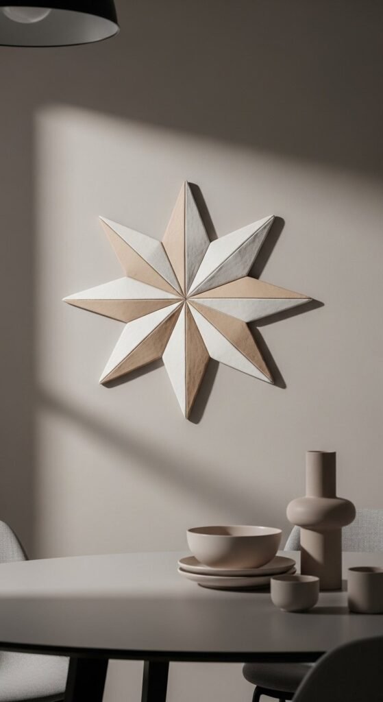
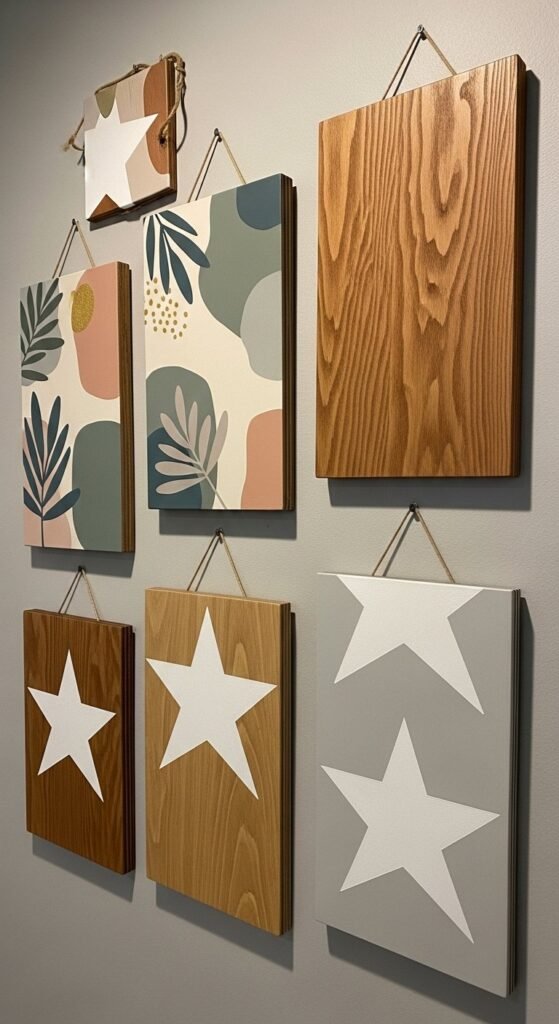
16. Sculptural MDF Wall Stars
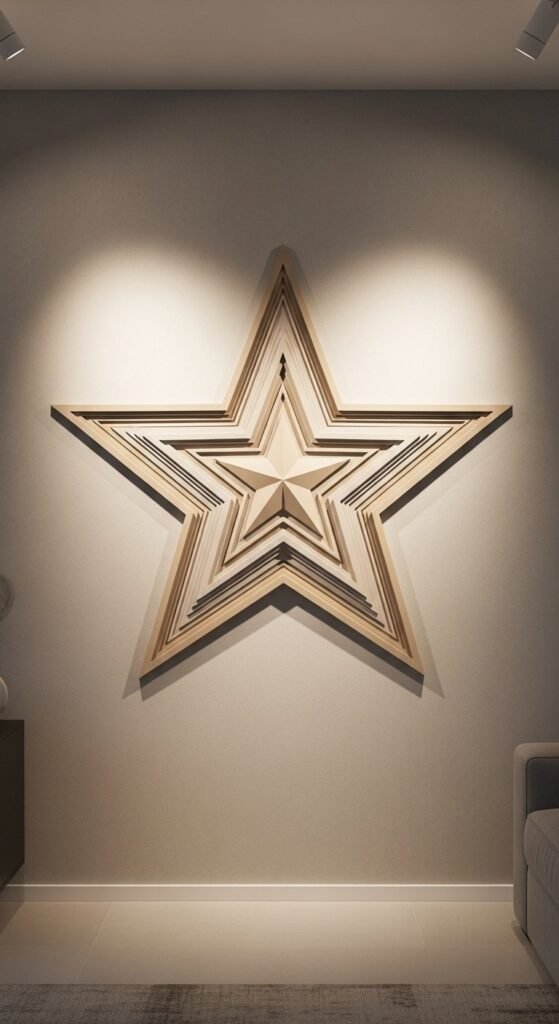
MDF stars work because they look architectural, not decorative. Size matters. One large piece or two medium ones feel deliberate. Small stars scattered around don’t.
Cut clean edges and sand thoroughly. Sharp corners keep the form crisp. Paint with chalk or mineral paint for a flat, grounded finish. Avoid shine. Light should fall across the surface, not bounce off it.
Hang stars slightly off-center rather than dead middle. That asymmetry feels intentional. Leave breathing room around them so the shape stands alone.
For budget builds, stack two MDF layers for depth instead of carving. Shadow does the rest.
This style fits modern, boho, and Japandi spaces. Keep surrounding decor restrained. Form and shadow are the entire point here.
17. Faux Capiz Shell Wall Art
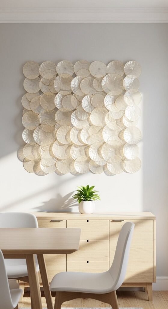
Capiz-style art reads expensive because of light interaction. You don’t need a real shell. Thin plastic sheets or packaging cut into circles work surprisingly well.
Layer loosely so light passes through. Uniform spacing kills the effect. Slight overlap adds movement. Stick to soft ivory or pale cream for a refined look.
Mount on a neutral backing or let pieces float individually. Both work if spacing stays consistent.
This style shines in dining rooms or near windows where daylight changes throughout the day. Artificial light alone flattens it.
For renters, keep panels lightweight and use removable hooks. Test weight before committing.
Light response is what gives this its high-end feel.
18. Pressed Botanical Frame Set
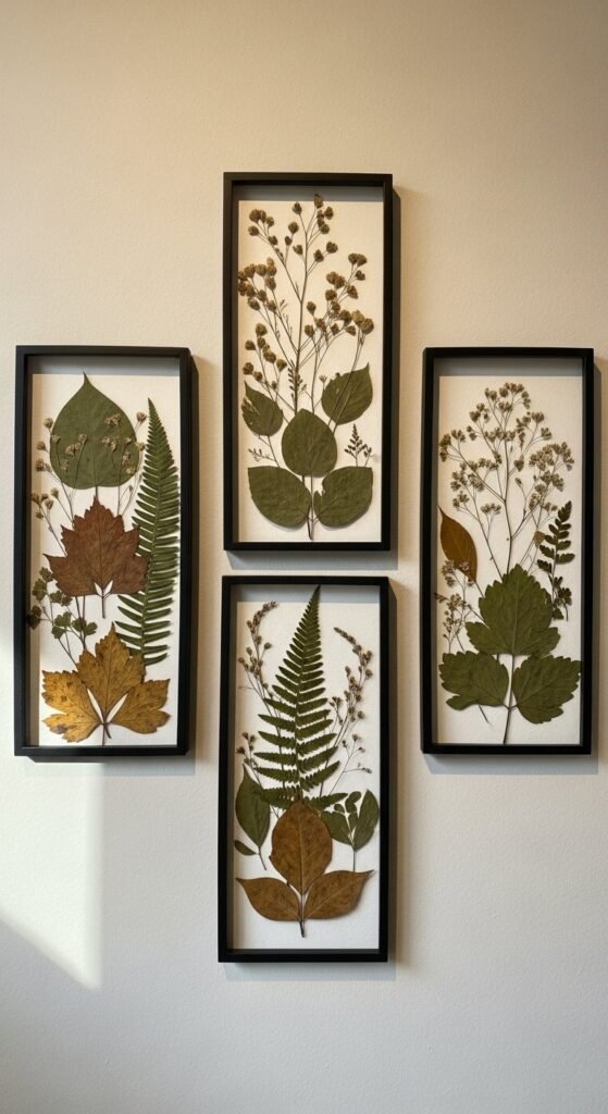
Pressed plants feel curated when restraint leads. Choose one plant type per frame. Ferns, eucalyptus, or grasses work well. Mixing species weakens cohesion.
Use identical frames and mats. Thin black or light wood keeps attention on the plant. Space frames evenly in a straight line for order.
Dry plants fully before framing to prevent discoloration. Heavy books work fine. No special tools needed.
This works beautifully in hallways, staircases, or bedrooms. Avoid kitchens where humidity can interfere.
For budget sourcing, backyard clippings or park walks are enough. The value comes from selection, not rarity.
Consistency in presentation is what keeps this from feeling like a craft project.
19. Large Fabric Wall Tapestry Panel
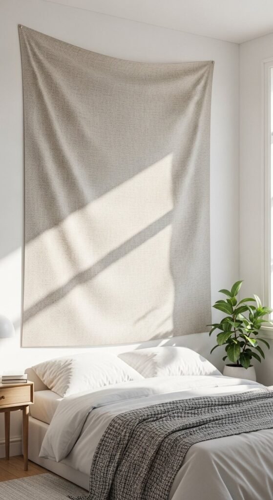
Fabric panels create softness without clutter. Choose heavy fabric with weight linen blends or canvas work best. Thin fabric wrinkles and sags.
Mount flat, not draped. That’s the difference between casual and composed. Use a wooden batten at the top and bottom to keep lines straight.
Color should stay neutral. Texture does the work. Too much pattern dates quickly.
This works well behind beds or sofas where large surfaces feel bare. It also improves acoustics quietly.
For low budgets, use drop cloths or upholstery remnants. Steam before hanging for clean lines.
Surface calmness is what makes this feel intentional and grounded.
20. Minimal Wall Organizer as Art
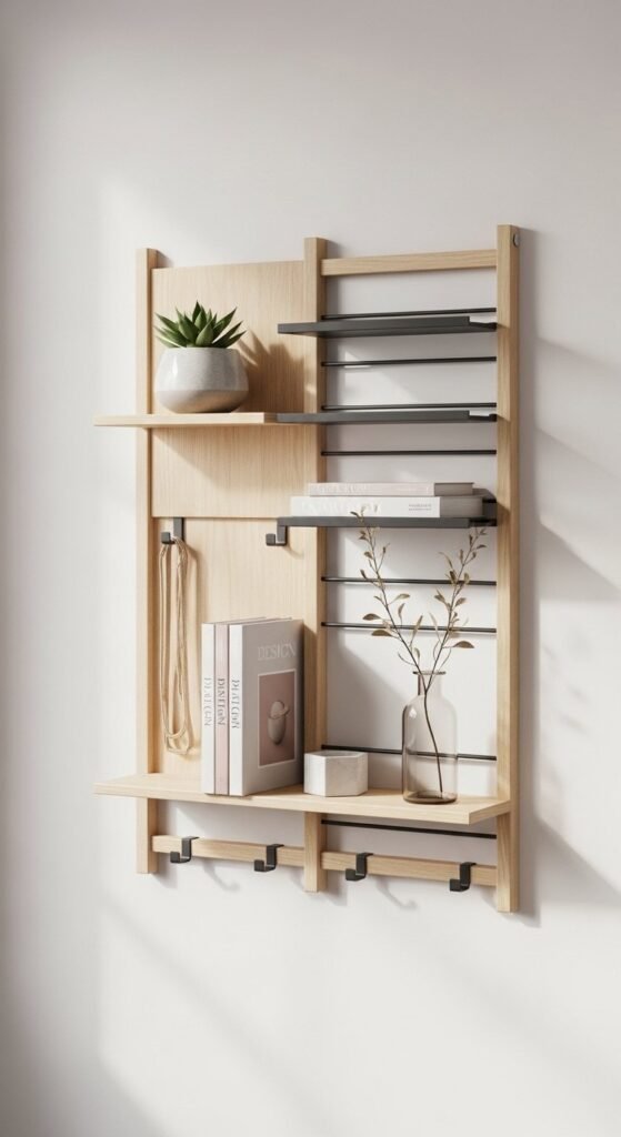
Functional pieces look refined when they’re treated like art. Choose simple shapes. Straight lines. No excess compartments.
Keep items sparse. One notebook. One small tray. One hook section. Overfilling turns it into storage, not decor.
DIY versions work well with plywood and slim metal rods. Sand edges clean. Finish matte.
This fits entryways, offices, or kitchen corners. Pair with blank wall space so the form reads clearly.
Mount level and centered within its zone. Precision is non-negotiable here.
Intentional restraint is what allows function to look composed instead of busy.
21. Color-Blocked Half-Paint Wall Art
Half-painted walls work because they feel graphic without being loud. Choose two closely related tones. High contrast looks trendy fast, then dated. Soft contrast lasts longer.
Measure carefully before painting. A crooked line ruins the effect. Use painter’s tape and step back to check alignment before committing.
This works well behind furniture. Consoles, benches, or low shelves anchor the painted area so it feels intentional. Floating paint alone can feel unfinished.
The budget impact is high here. One quart of paint goes far. Time spent measuring matters more than materials.
For renters, keep the painted area compact. Easier to repaint later.
Controlled contrast is what makes this feel architectural instead of decorative.
22. Oversized Abstract Canvas Art
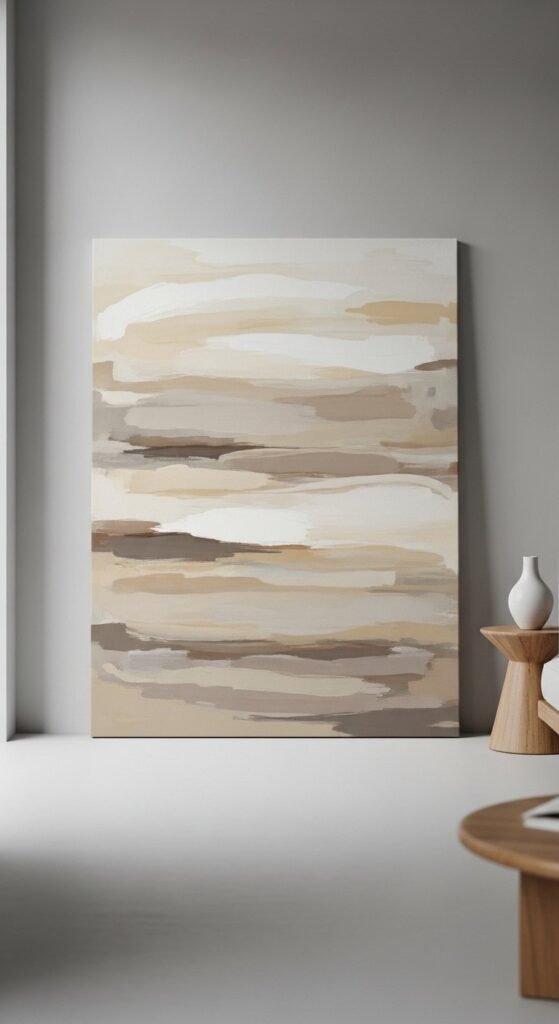
Large art feels expensive because scale is expensive in retail. DIY changes that equation. Stick to neutral tones. Beige, stone, muted taupe.
Use broad strokes. Small details cheapen the look. Let layers dry between passes so texture builds naturally.
Leaning the canvas instead of hanging it adds a relaxed, gallery feel. This works especially well near consoles or shelves.
Use inexpensive canvas and basic wall paint. No specialty supplies required. The trick is restraint.
Avoid overworking. Stop earlier than you think. Negative space is part of the composition.
Scale over detail is why this reads high-end.
23. Faux Architectural Wall Molding
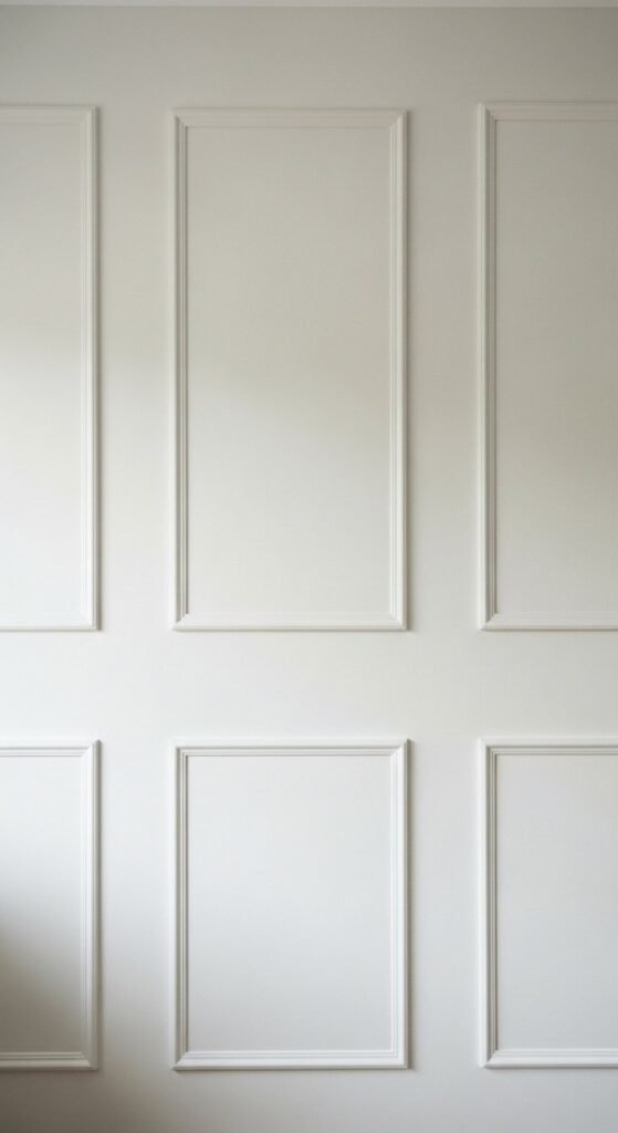
Wall molding suggests craftsmanship and permanence. That’s why it feels upscale immediately. Lightweight trim or MDF strips work well.
Plan your grid first. Uneven spacing shows instantly. Use a level and mark lightly before attaching.
Paint everything the same color as the wall. Contrast defeats the illusion. The shadow lines are enough.
This works best on large blank walls. Living rooms and bedrooms benefit most. Avoid small, crowded spaces.
For renters, attach with removable adhesive strips instead of nails. Keep trim thin to reduce weight.
Shadow and symmetry do the heavy lifting here.
24. Hanging Wooden Bead Garlands
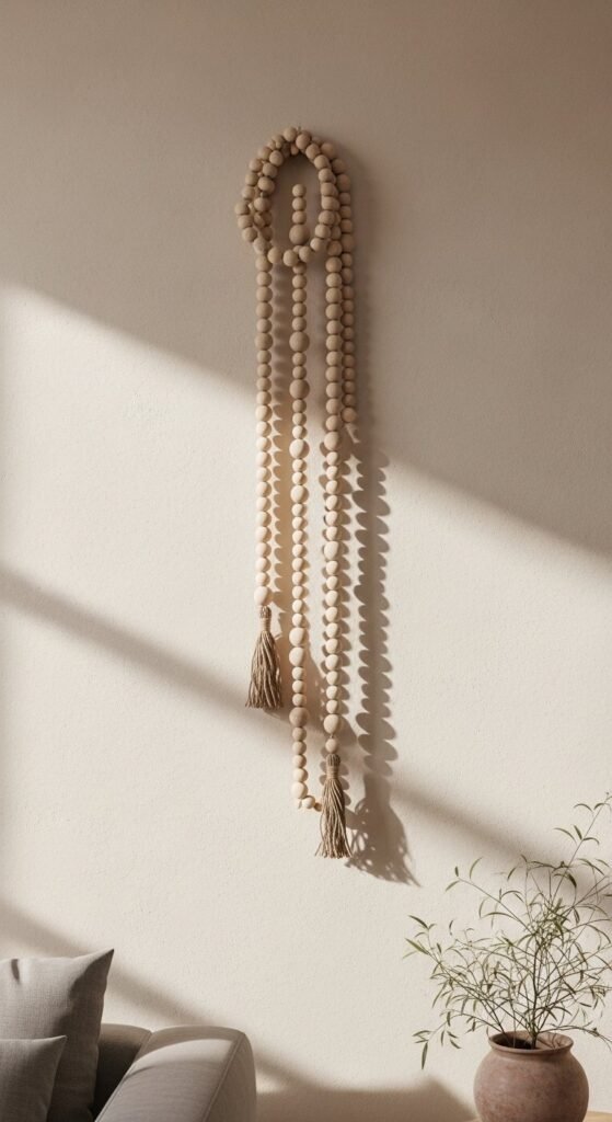
Wood bead garlands feel calm when the scale is right. Go longer than you think. Short strands feel decorative. Long strands feel intentional.
Stick to natural wood or lightly whitewashed beads. Painted colors break the organic look.
Hang with simple hooks or nails hidden behind beads. Spacing between strands matters. Too close looks busy.
This works well on narrow wall sections, columns, or between windows. Avoid wide walls unless grouping multiple strands.
DIY versions are simple. Wooden beads, string, patience. That’s it.
Vertical rhythm is what gives this quiet presence.
25. Tool-Free Gallery Frame Wall
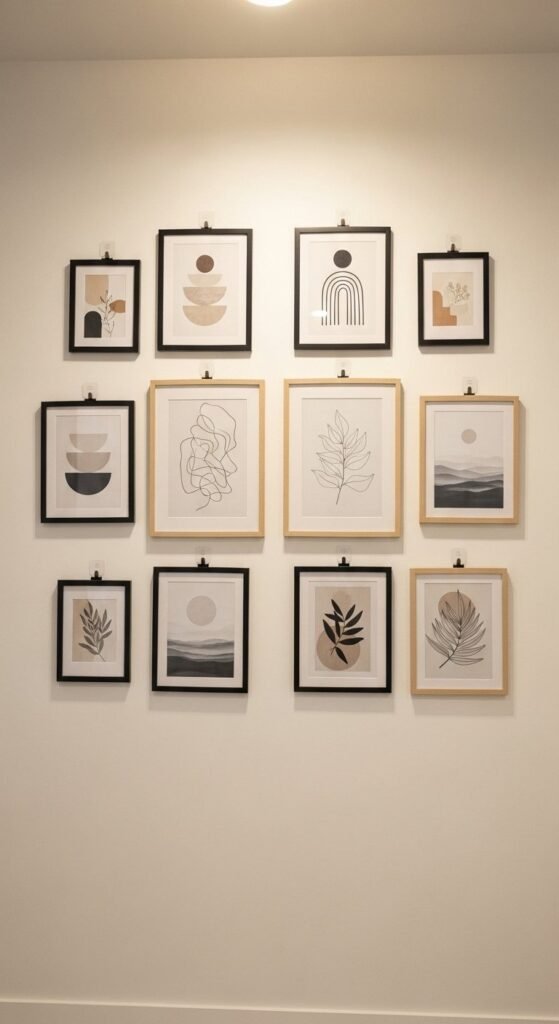
Gallery walls feel refined when alignment is respected. Use identical frame sizes or a strict pattern. Random layouts rarely read clean.
Choose neutral art. Line drawings, abstracts, or typography-free prints work best. Loud imagery overwhelms.
Lay the layout on the floor first. Photograph it. Adjust before mounting. This step saves walls and time.
Use removable hooks rated for frame weight. Press firmly and wait before hanging. Patience prevents damage.
This works in rentals, dorms, and apartments without compromise.
Order is what turns many frames into one statement.

Leave a Reply