
1. Sheer Café Curtains at the Window
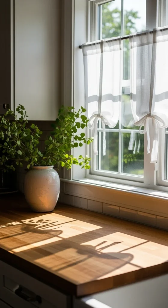
Café curtains work because they change the mood without locking you into a season. Light filters in. Privacy stays intact. Choose linen or cotton voile for movement and texture. Hang them halfway up the window so counters still glow during the day. Sheer fabrics create a lighter, brighter feel without blocking views.
Budget trick: tablecloths or linen scarves can be clipped to tension rods. For color, try faint pinstripes or micro florals instead of bold prints. If your kitchen faces north, keep the fabric white or cream to reflect every bit of daylight. Washable panels matter in cooking spaces. This is one of the fastest swaps with the biggest visual reward.
2. Flowering Branches in a Statement Vase
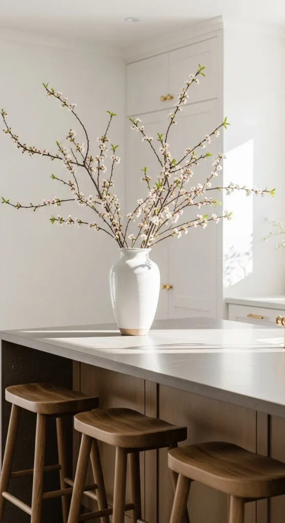
Branches feel intentional and architectural. They last longer than bouquets and fill vertical space. Cherry, quince, or faux dogwood all work. Keep the vase simple so the shape of the branches stands out. Think sculptural, not crowded.
Foraging tip: trim branches from your yard before buds open and let them bloom indoors. Rotate them every few days for balance. If storage is tight, keep one neutral vessel year-round and only swap what goes inside. This keeps spending low and styling quick.
3. Colorful Tea Towels on Display
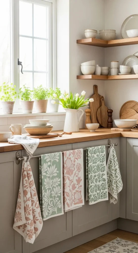
Tea towels are small but powerful. They introduce pattern and color without clutter. Block prints and thin stripes feel handmade rather than seasonal gimmicks. Drape them over oven handles or hang from hooks near the sink. This is a reversible swap that takes seconds.
DIY idea: stitch ribbon loops onto thrifted linens. Stick to two colors so things look calm, not busy. Wash often so they stay crisp and inviting.
4. Open Shelf Botanical Vignette
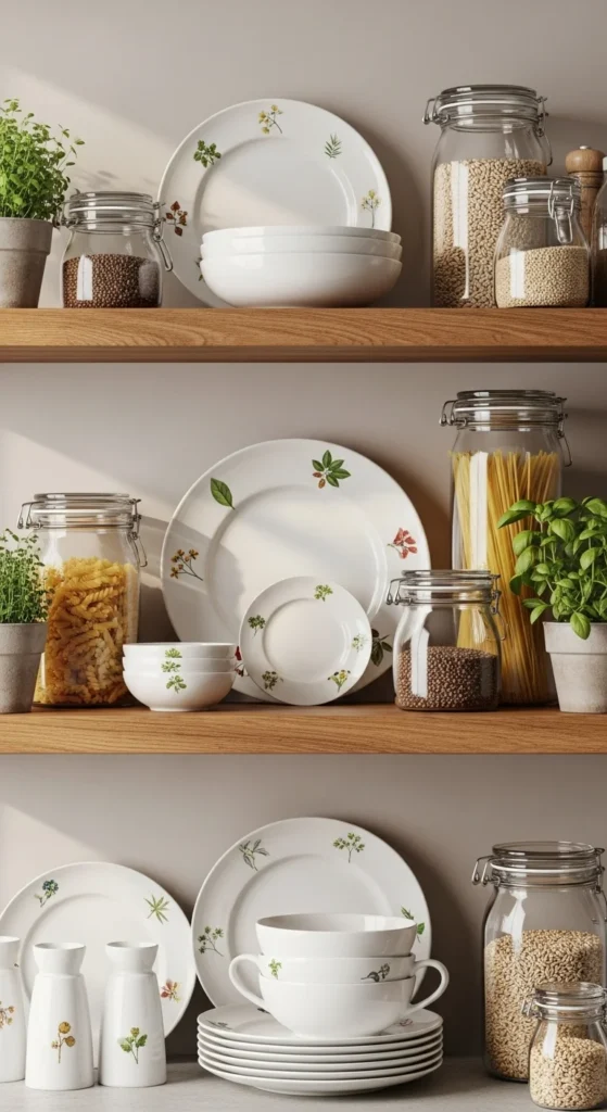
Instead of redecorating the whole kitchen, style one shelf. Group ceramics with botanical details alongside clear glass and wood. Leave negative space. Odd numbers look natural. A single vignette feels curated, not cluttered.
Budget tip: thrift mismatched plates with similar tones. Stand them upright using plate stands. Rotate items seasonally while keeping the base palette the same.
5. Pastel-but-Punchy Color Pairing
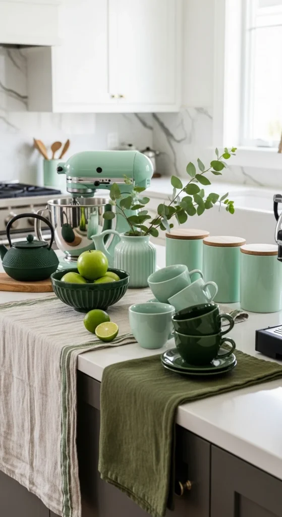
Soft colors work better when grounded. Pair pale blue with navy. Blush with burgundy. Mint with deep green. This keeps the look from drifting into nursery territory. Contrast creates confidence.
Apply the formula through accessories only. Mugs, canisters, or runners are enough. If your kitchen is neutral, this method feels intentional and repeatable every year.
6. Styled Kitchen Island Tray
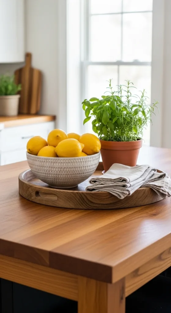
Trays organize decor so it doesn’t interfere with cooking. Keep it low and movable. Mix one living element, one functional item, and one textural piece. Islands act like furniture now.
Swap contents with the seasons while keeping the tray itself. Thrifted wood or metal trays work just as well as new ones.
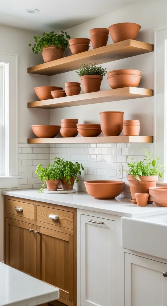
7. Indoor Herb Garden by the Sink
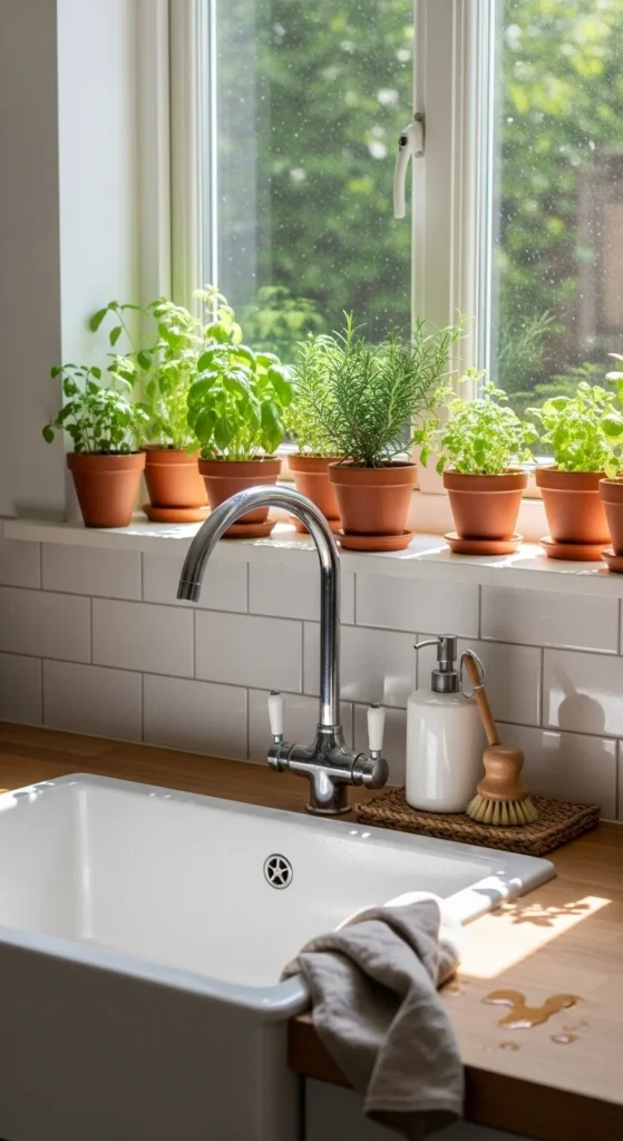
Herbs add color and purpose. Basil, mint, and rosemary thrive near light. Group pots in odd numbers for balance. Terra-cotta brings warmth against white surfaces. Living elements change the atmosphere instantly.
No window? Use a slim grow light under cabinets. It doubles as task lighting.
8. Ceramic Dishes as Decor
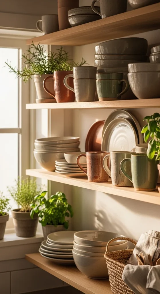
Ceramics don’t belong hidden away. Stack plates vertically. Line mugs by color family. Choose handmade or slightly imperfect pieces. Texture matters more than quantity.
Rotate everyday dishes into display and store the extras. This avoids buying decor that has no function.
9. Woven Baskets for Texture
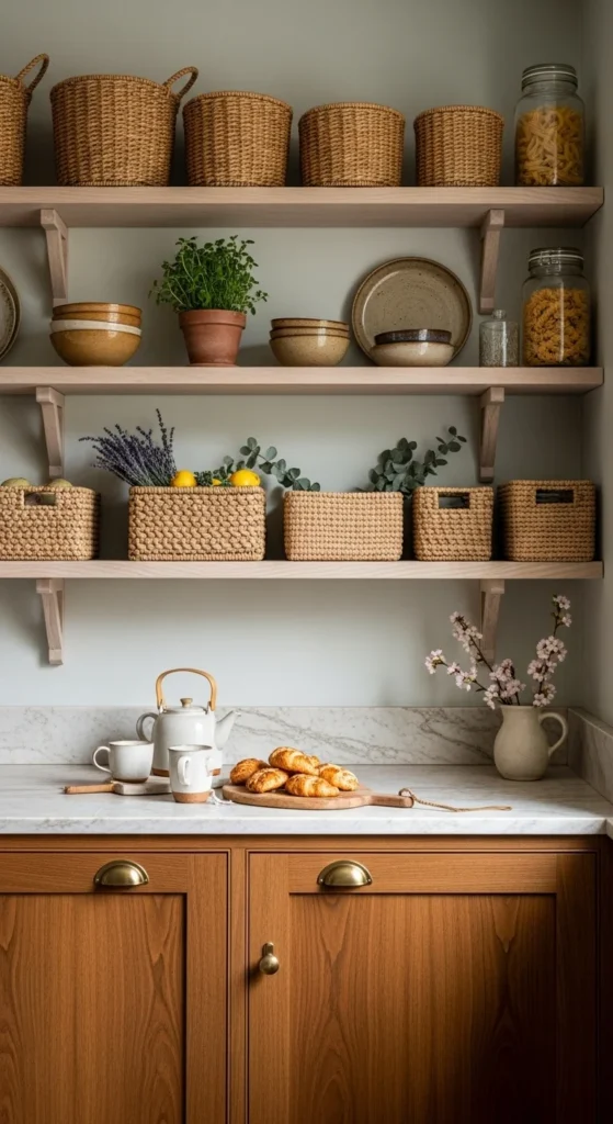
Baskets soften hard surfaces. Use them for produce, linens, or mail. Natural fibers balance stone and metal. Layered textures add quiet richness.
Thrift stores are full of options. Stick to one weave style to keep it cohesive.
10. Light-Colored Counter Runner
Runners define zones and protect surfaces. Linen or cotton works best in kitchens. Keep patterns subtle. Think tone-on-tone.
Washable fabrics matter here. Fold or roll when not in use to keep counters flexible.
11. Small-Scale Botanical Prints
Tiny florals read more modern than oversized blooms. Black or wood frames keep them grounded. Hang in a tight grid or simple row. Scale changes everything.
Printable art online makes this affordable. Use mats to unify different images.
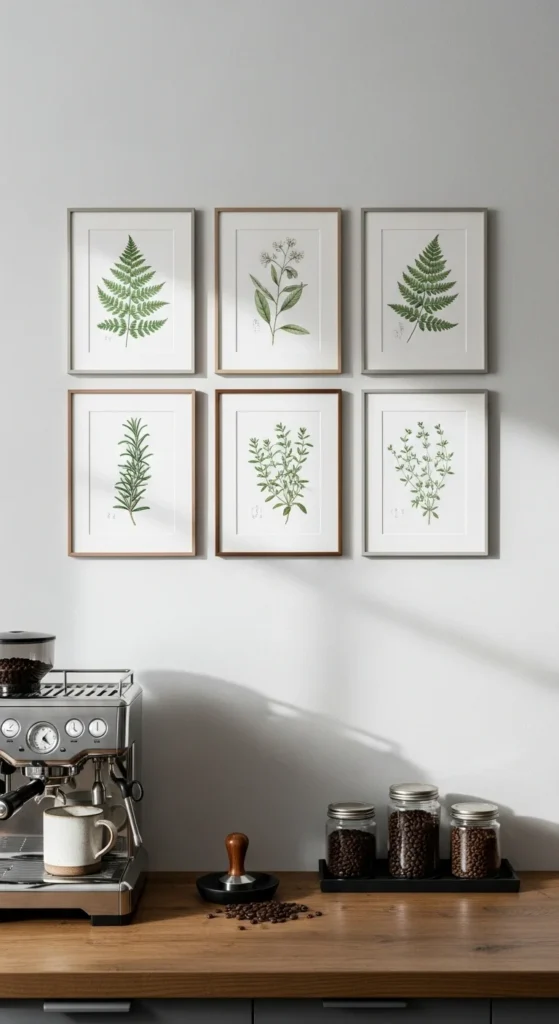
12. Beverage Station Spring Styling
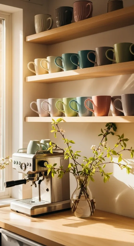
Coffee areas get daily attention, so style them. Swap mugs. Add a plant. Keep surfaces clear. Function comes first.
Use a small tray to corral items. This makes cleanup easy and keeps things tidy.
13. Terra-Cotta Accents
Warm clay tones act like neutrals now. Mix with whites and greens. Keep it subtle. One or two pieces go a long way. Earth tones ground lighter palettes.
Old planters or baking dishes work perfectly here.
14. Glass Jars with Pantry Staples
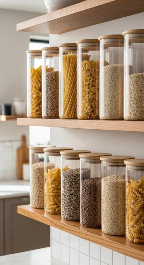
Clear containers add rhythm and order. They also reflect light. Decant what you already own. This is decor that earns its place.
Uniform jars look calm. Labels can be minimal or skipped altogether.
15. Vintage Cutting Boards as Backdrop
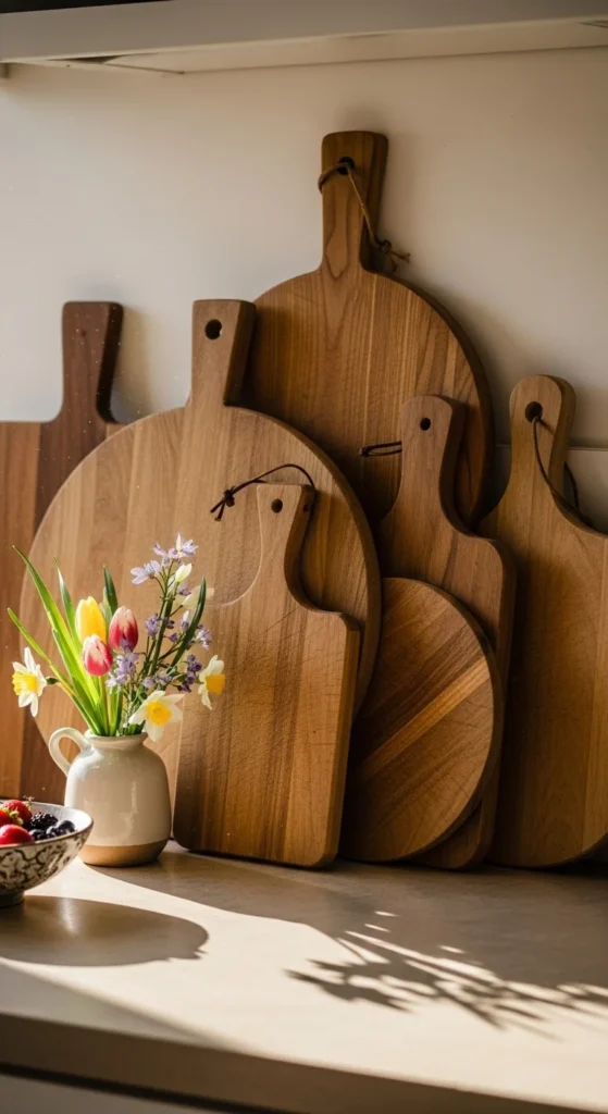
Boards add warmth vertically. Lean them instead of hanging to avoid extra holes. Mix shapes but keep wood tones similar. Worn surfaces feel relaxed and welcoming.
Thrifted boards often have the best character.
16. Soft Green Accents
Green connects kitchens to nature. Sage, olive, or moss tones work well. Use sparingly. One color, repeated lightly.
This plays well with both modern and farmhouse spaces.
17. Light Reflecting Mirror Accent
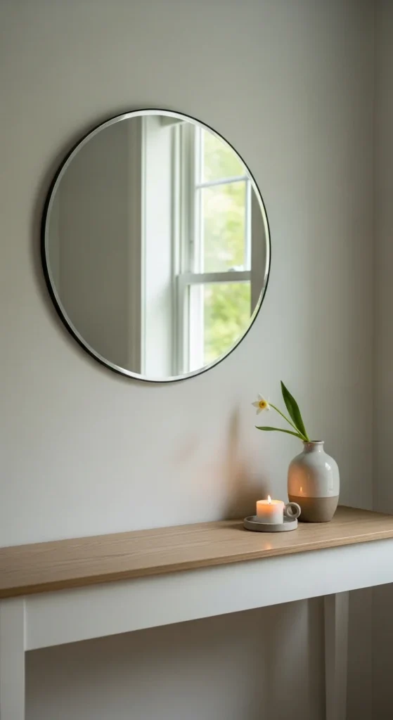
Mirrors bounce light in darker kitchens. Choose simple frames. Keep them small and intentional. Placement matters more than size.
This works especially well near breakfast nooks or sideboards.
18. Linen Seat Cushions
Swap seat textiles for warmer months. Linen and cotton feel breathable and casual. Tie-on styles are easy to remove. Comfort meets style here.
Neutral shades keep them reusable beyond one season.
19. Thrifted Crock for Utensils
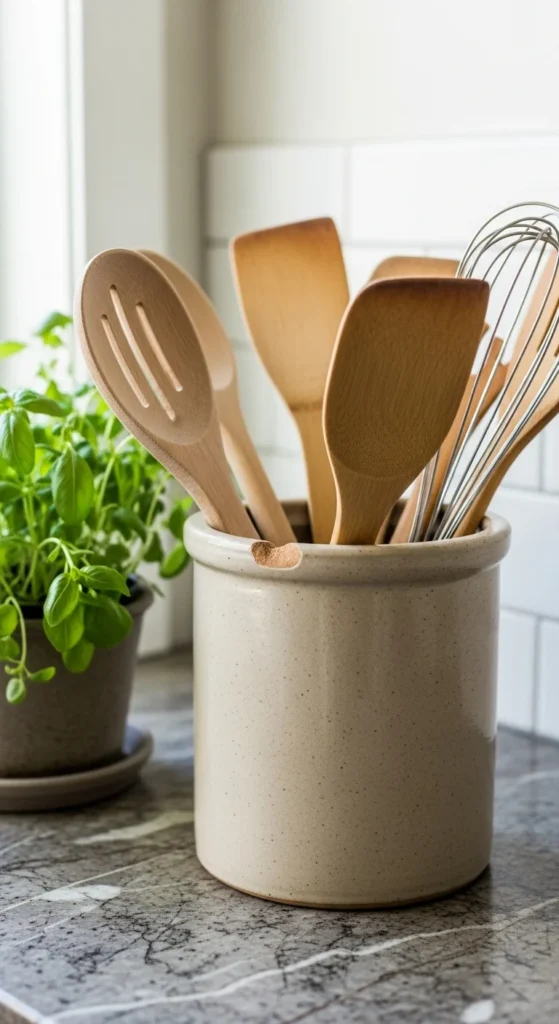
Old crocks add history and texture. Use them near the stove for tools you grab often. Functional decor reduces clutter.
Mismatched pieces feel collected rather than styled.
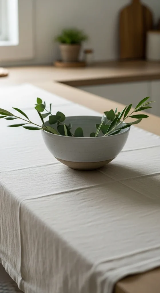
20. Minimal Floral Centerpiece
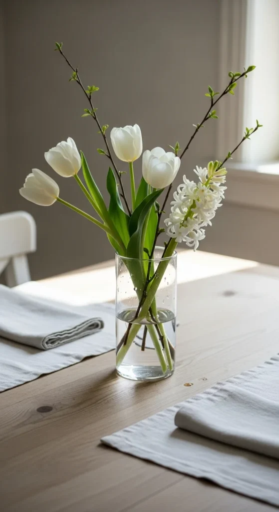
Keep arrangements loose and low. Fewer stems look intentional. Clear glass keeps things light. Less feels calmer.
Reuse bottles or jars. Change stems weekly to keep the look current.
21. Block-Print Napkins for a Handmade Look
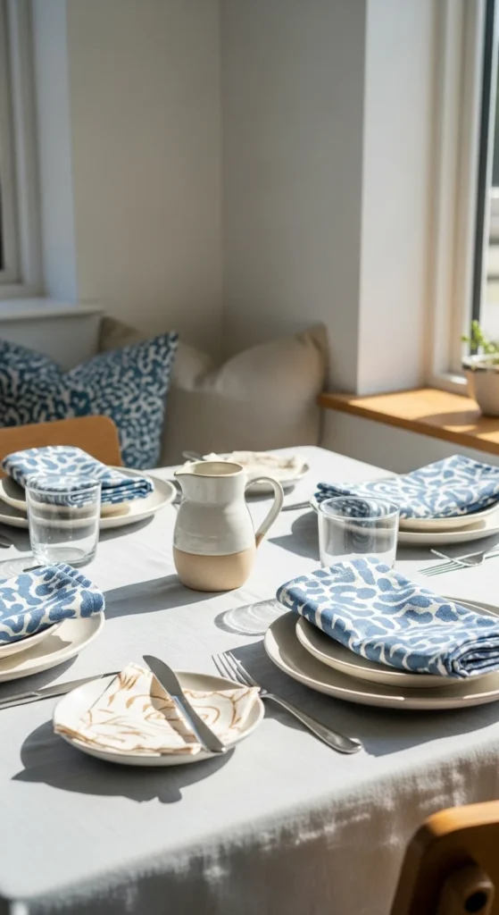
Block print reads collected and global without screaming “theme.” Start small with napkins so the pattern feels like a detail, not a takeover. Fold them casually under plates or tie with twine for a relaxed table moment. Handmade-looking pattern is the shortcut here.
DIY route: buy block-print fabric by the yard and hem simple squares. No sewing machine? Fabric tape works for a clean edge, and it holds up surprisingly well if you hand-wash. Budget option: check Etsy or local markets for imperfect sets—slight misprints often cost less and look more authentic.
To keep it cohesive, repeat the napkin color somewhere else: a mug, a dish towel, or a small vase. If your kitchen is already busy, stick to one print and let everything else stay neutral. If it’s minimalist, add a second texture like rattan placemats to prevent the table from feeling flat.
22. Sculptural Pendant Bulb Swap Over the Island
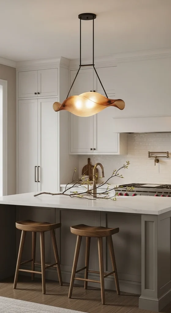
Lighting changes how every surface reads, even when you don’t touch a single cabinet. If a full fixture swap is too much, start with the bulb. Choose a warm, soft-white tone so counters feel welcoming instead of clinical. Mood-first lighting makes meals feel more intentional.
If you can swap the shade, go for something curvy or pleated that feels like decor, not hardware. For rentals, plug-in pendants exist, and they can hang from ceiling hooks with minimal fuss. Another trick: add a dimmer at the wall (or a smart bulb) so you can shift from bright prep light to softer evening light.
Keep the rest of the island styling simple so the pendant gets its moment—one tray, one vessel, one bowl. If your kitchen lacks windows, this becomes even more valuable. Think of it like candlelight for everyday life, just easier to manage.
23. Upcycled Baking Pan Wall “Art”
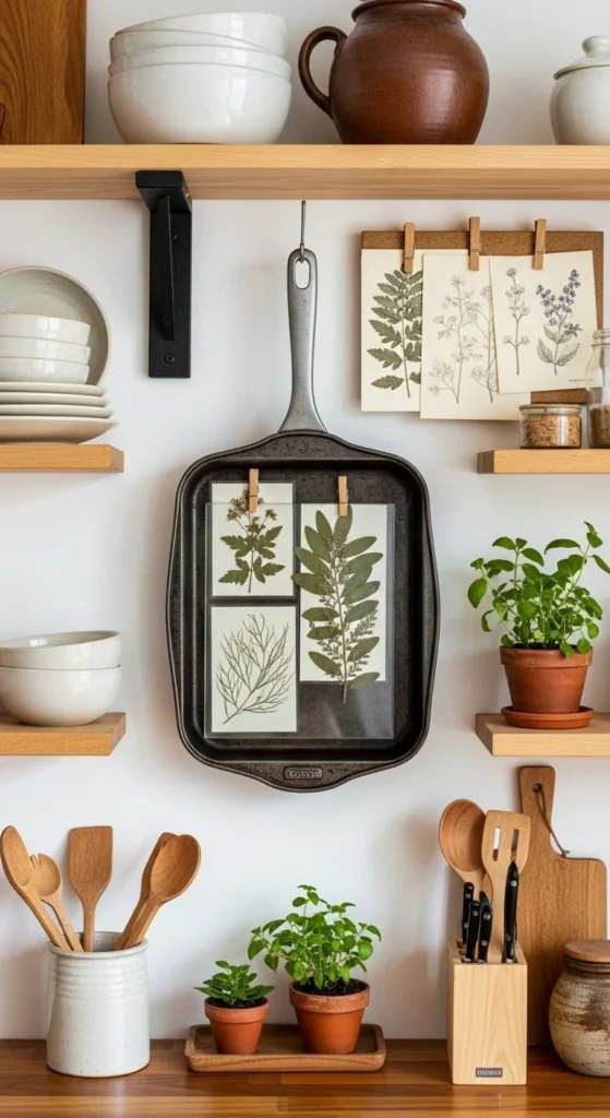
This is the sustainability-friendly idea most spring content skips. Old baking sheets, muffin tins, even scratched trays can become wall decor with personality. Clip small botanical prints, recipe cards, or pressed leaves inside the pan like a frame. Thrifted character pieces make a kitchen feel lived-in.
DIY method: clean the pan, add removable adhesive strips on the back, and hang it like art. Use mini binder clips or washi tape to attach your “gallery” inside. Swap the contents whenever you want—no commitment.
For a polished look, keep the inserts in one color family: black-and-white sketches, muted greens, or soft pastels. If your kitchen leans modern, choose a sleek sheet pan and minimal prints. If it’s a farmhouse, go for worn metal and a looser arrangement. It’s decor that starts conversations and costs very little.
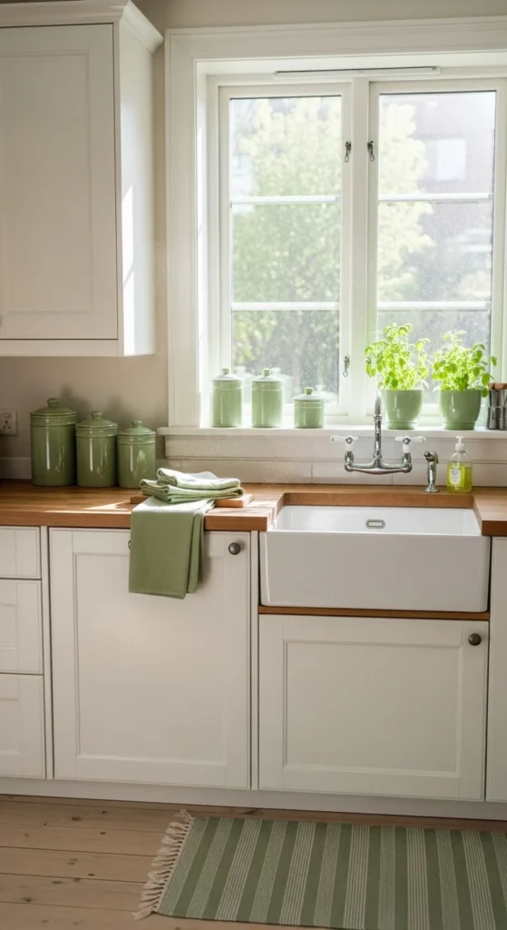
24. A “Spring Soap Station” by the Sink
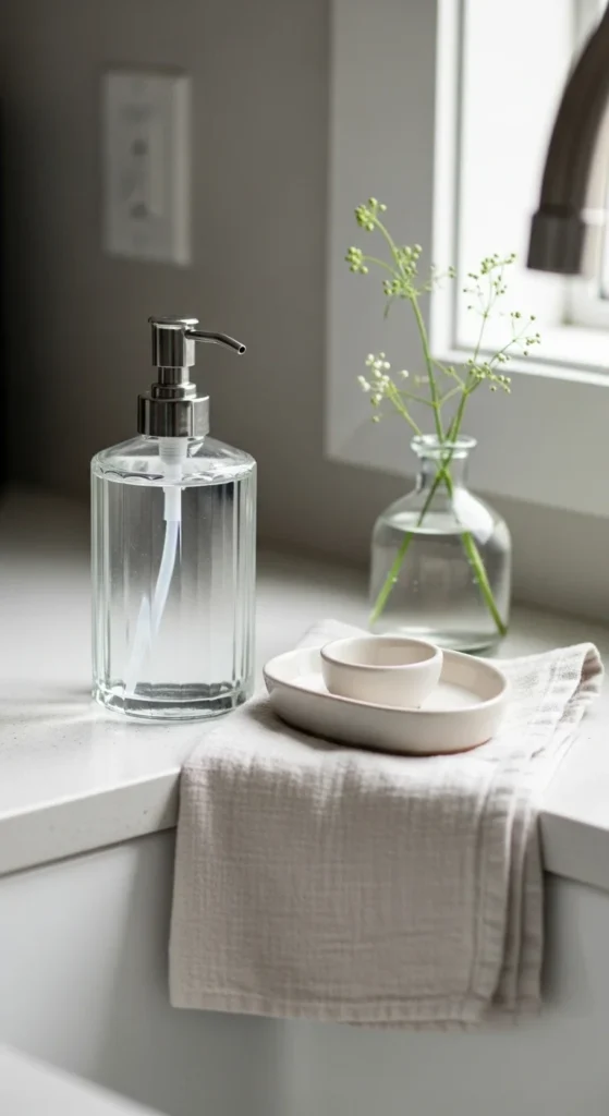
The sink area is a daily touchpoint, so small styling changes show up fast. Swap the plastic bottle for a glass dispenser and add a small dish for rings or sponges. Fold a light towel neatly and keep the palette simple. Little swaps, big visual payoff—especially here.
Budget version: reuse an old syrup bottle or olive oil bottle as a dispenser (you can buy pumps cheaply online or at craft stores). Choose a scent that feels springlike without being overpowering, and keep refills under the sink so the counter stays clear.
If you want a hint of color, do it through the towel or a tiny vase. One stem is enough. For darker kitchens, pick clear or white accessories so light bounces around the sink zone. This also helps the space look cleaner between deep cleans, which is a win in a hard-working room.

Leave a Reply